NHL Power Rankings: Each team’s most iconic jersey
Hockey jerseys are some of the most iconic articles of clothing in the sports world. This week’s NHL power rankings look at the best sweater each team has ever had.
In all of sports, no one cherishes their team’s jerseys quite like hockey fans. Next time you attend a hockey game, look around and observe everyone wearing their team’s colors. Fans will cover their jersey in stains and sweat and never wash them, and wear that sweater with pride.
Whenever a team decides to change their jersey, fans immediately take notice. Changes can be minor, major, or complete overhaul. Fans sometimes love and embrace it, sometimes hate it, but always have comments about it. But all in all, the jersey is the spokesperson for the team’s identity.
More from Puck Prose
- Detroit Red Wings 2023 Rookie Camp Has Plenty of Ups and Downs
- This Columbus Blue Jackets rookie doesn’t want to be forgotten
- 2 trades the Boston Bruins must make to secure the Stanley Cup
- 3 reasons the Avalanche won’t win the Stanley Cup in 2024
- This is a big year for Alex Turcotte and the Los Angeles Kings
All throughout history, teams have gone through many jerseys. Some were good, some were bad. Some were so good that they never changed, some were so bad that they were mothballed immediately, or named things like “Turd Burger”. Everyone has their favorites from their team’s history.
Here, we’re going to go through each team’s jersey history and find the jersey that really can be called the best jersey in team history. This jersey is going be both easy on the eyes, and a jersey that can be associated with success. This jersey is going to be one that fans should be wearing proudly. This jersey is going to be the jersey that screams the teams’ identity.
The criteria we will be using for this list is interesting. We will be looking at a jersey that has a great design, staying power, and if it was worn while lifting a Stanley Cup, bonus points will be scored.
Quick disclaimer, this is just my opinion. I do consider myself a nerd for this kind of research, so I can get a little biased toward jerseys I grew up watching, and the more fun designs can get a little more of a look than others. If you have any other jersey in your teams’ history that you think is more deserving of the threads I chose here, let me know in the comments.
Let’s jump in!
Pacific Division
Anaheim Ducks
1993-2006 Original Eggplant jersey
The Anaheim Ducks began life as the Mighty Ducks of Anaheim, wearing the unique color combination of eggplant purple and jade green, and had the hem stripes travel up diagonally across the waist (a design used almost exclusively by the Ducks during that time). They also used their iconic duck-mask logo on the front. The only points against this jersey is probably it’s roots in the Disney movie the team was named after.
When the team rebranded as the Ducks, they rid themselves of all Mighty, duck-mask, eggplant, or jade. But slowly but surely, the team is gradually bringing back the Disney history that the team began history with. The Ducks will honor all of their previous jerseys in pregame warmups throught the year. That’s your hint that the team got it right in the first few years of it’s history.
Arizona Coyotes
1996-2003 Original Black jersey
After moving from Winnipeg to Phoenix, the team wore jerseys with black, brick red, and green colors, kachina-patterned striping, and a trippy-looking coyote with half a goalie mask on as a logo. The design was very consistent with the era of the 1990’s, where classic hockey design was often set aside for something a little more out of the box. The team scrapped these jerseys after the 2003 season for a much cleaner design.
Though, there’s a reason why these jerseys made a return recently, and have even been named the third jersey for the Coyotes this past summer. The team brought it back for throwback nights the last couple of seasons, and the fans loved it. The look is perfect for the team and fits right in with the locale and culture.
Calgary Flames
1980-1994 Original Red jersey
Starting in 1994 after these jerseys were set aside, the Flames starting using black as a trim color, and it’s made it’s way from just a trim to a primary color in 2000. Nowadays, the team’s main jersey is red (good), but the black lettering (bad) and trim use takes away from a classic color combination of red and yellow. The team is named the Flames, not the Ash, after all.
The jersey worn by the 1989 team led by Lanny McDonald’s mustache is a perfect example of a jersey where black isn’t used in an accent role, and the colors pop more. The actual design of the jersey was also more classic style, with the triple stripe around the sleeves and hem. The team revived these for 2009-13 in a heritage role, and also wore it in 2016-17. It looked great, and I hoped it’d be used in a full-time role.
Edmonton Oilers
1981-1994 Blue jersey
An easy way to establish an identity is to win a lot and win early. The Gretzky-era Oilers did just that, and looked good doing it. Royal blue and orange was in style in the 1980’s NHL color palette, with the Islanders also creating a dynasty in those colors, and the Oilers had a great design with those colors. The orange shoulder yoke was unique to the team in that era, and the triple stripe on the sleeves and hem were a great balance for the blue uniform.
The Oilers brought this jersey back as a third jersey in 2008, and was upgraded to full time after the 2011 season. They set them aside for their current orange jersey, but we may expect the team to bring the blue back as an alternate design.
Also, fun fact about the Oilers jerseys in the 80’s, Nike (the team’s jersey sponsor) put their logo on the left side of the bottom of the back of the jersey instead of the right side on Gretzky’s jersey, because Gretzky liked to tuck in the right side of his uniform. Neither of these ideas are relevant today, but it’s still fun.
Los Angeles Kings
1967-1980 Forum Blue jersey
The Kings have had several color combinations in their history, and all of them was unique to the team. They started with purple (called Forum Blue) and yellow, then changed to black and silver, then black and purple, then returned to black and silver. But over the past few years, the team has thrown back to the original purple and yellow duds worn by team greats such as Marcel Dionne in the 1970’s.
The design was clean and simple, the colors were completely unique to the NHL (and matched with their arena-mates, the NBA’s Lakers), and the crown logo was great as a standalone on the chest of the jersey. The Kings wore this jersey as a heritage jersey in the mid 2010’s, and it looked just as good then as it did in their original days.
San Jose Sharks
1991-1998 Original Teal jersey
The Sharks were the first team in the NHL to wear teal as a primary color, and deserve credit for immediately taking ownership of a color. Their original road jerseys were teal with white and silver stripes, the classic shark-biting-stick logo, and the dorsal fin logo on the shoulders was a great secondary logo. The main feature of the jersey, though, was the classic teal color that defined the jersey.
This jersey allowed the Sharks to settle into their unique identity. Over the course of their history, they’ve gone through a couple of changes to their uniform, but the one constant in all those changes is the teal. The team wore the original teal jersey as a throwback during the 2015-16 season, and they looked fantastic on the ice.
Vancouver Canucks
1970-1972 Original White jersey
The Canucks have had tons of different designs over the years. They started in classic green and blue, changed to red/black/yellow, moved to navy/blue/red, then back to green and blue. They’ve had spaceman V jerseys, flying skates, and orca whales on the front of their uniforms. The most consistent uniform they’ve ever had is actually the kit they wear now. But in my humble opinion, they got it right the first time.
The classic stick-in-rink logo is simple and aged well. The colors were perfect for the Pacific Northwest. My favorite part of the original white jersey was actually the sleeve, with green and blue stripes and a white V cutting through in negative space. It’s a little feature, but it’s unique and clever. This jersey may have been lost over time, and brought back once to celebrate the Canucks’ 40th year, but it’s interesting enough to be brought back again soon.
Vegas Golden Knights
2017-present Original White jersey
The Golden Knights have just gotten their existence underway, and therefore have just two uniforms to pick from as their best. There are unique aspects to their aesthetic identity, such as the gold-flaked stripes around the sleeves, and the design within those sleeves and on the logo. It’s hard to say which one is better, the home gray or the road white.
We’ll go with the road whites for a couple of reasons. Firstly, the Knights wear white colored gloves with the white jerseys, which is unique in the NHL. Secondly, black isn’t used as an accent color, which allows the gold and red on the sleeves to really stretch their legs and pop more.
It’s only been one year so far, so let’s let the Knights age into their look for a bit, then we can revisit this debate.
Atlantic Division
Boston Bruins
1967-74 Black jersey
The Bruins have had a plethora of designs over the years, ranging from brown and yellow stripes to cartoon bears. Their classic spoked-B logo (actually started life as an anniversary logo, but just stuck after that) is simple and timeless. Their colors are perfect together. Perhaps their most iconic look comes from their most iconic player, Bobby Orr.
Yellow shoulder yokes with a white outline underneath, classic triple stripes on the sleeves and hem, and the yellow version of the spoked-B that seems to have gotten lost these days, all add up to a jersey that goes down as an all-time great. This jersey is the same jersey the Bruins wore when Orr took flight in 1970, an iconic part of hockey history, not just Boston’s. Today’s jerseys closely resemble these classics, with a few tweaks here or there, and still look fantastic. But you can’t beat the original.
Buffalo Sabres
1970-1996 Original White jersey
The Sabres’ original look was gorgeous. The logo was classic, with the buffalo leaping over the crossed swords, the blue and yellow complimented each other well, and the design aged well between the French Connection era to the La-la-la-la-la-Lafontaine era. The white jersey featured a blue and yellow shoulder yoke that was well balanced with the alternating yellow-blue-yellow stripes at the hem and sleeves.
After these beauties, the Sabres overhauled into the Goat-head logo in red and black, then changed back to yellow and blue with the Buffa-slug logo, then brought back the original design but in navy and yellow (with the Turd Burger jersey mixed in there somewhere). Slowly but surely, the Sabres made amends for their mistakes and brought back a classic design, showing they should never have changed at all.
Detroit Red Wings
1937-present Red jersey
This pick is about as easy as it gets. Since 1937, the Red Wings have worn but 2 jerseys (with some modifications along the way, such as names on the back, minor logo facelifts, one year with curly numbers). But the look has remained the same, and seems to be destined never to change. When it works so well for so long, it becomes a sin to touch it.
The classic winged-wheel logo on red, a couple of white stripes to balance, and the captain’s letter on the right side (unique until the Arizona Coyotes started in 2016) are staples of Red Wings history. The jersey that was made famous by Mr. Hockey himself, Gordie Howe, and passed on for generations to come is a slam dunk for this list.
Florida Panthers
1993-2007 Original Red jersey
The Panthers had a great look during their first decade plus. The leaping cat logo (that picked up a stick in 1998) settled in well over time, and the red/navy/yellow was also one that seemed to fit well for the Panthers. The team actually had their best season in history wearing these jerseys, the year of the Rat Trick, where they made the Cup finals.
The sweeping shoulder yokes point down to a V shaped design on the sleeves, which works well together in terms of spacing. The striping pattern also worked nicely and wasn’t overdone. This is also in the 1990’s era, where teams were using designs that became infamous (Fish Sticks, Wild Wing, Burger King, basically any jersey with its own name).
The Panthers, playing in Sunrise, FL, is Miami’s team, and can also lead to some wacky designs. But the Panthers kept it relatively clean, which is a nice departure from Art Deco.
Montreal Canadiens
1917-present Original Red/Blue jersey
Another Original Six team, another classic jersey. Since 1917, the Canadiens have worn their classic Bleu Blanc et Rouge jerseys, with the CH logo on the front (H stands for hockey), red base with the white and blue stripes across the chest and sleeves. The white jerseys we see originated in 1941, and stuck around for all but 3 years since. But the red jersey hasn’t changed (not counting small trim changes) since the original season of the NHL.
The amount of Hall of Fame members that has worn these jerseys is staggering. The team has unrivaled success on and off the ice, and they haven’t changed their original brand since the beginning of the NHL over 100 years ago. There’s no question about choosing the best jersey for the Habs. It chooses itself.
Ottawa Senators
1992-2007 Original White jersey
The original Ottawa Senators wore red-white-black striped jerseys in the days they dominated hockey. That was until 1931, when the team had to pack up and move for financial reasons, folding a year later. Today’s Senators debuted with a centurion logo, but the same colors. Their original white jerseys had the logo front and center, and a unique sleeve design, black with red stripes enclosing the number.
The team has since incorporated new uniforms, which have stuck around more or less since these were discarded, but suffered from Reebok-itis, meaning colored in panels on the jersey instead of making a clean design. The jersey has been used ever since, and doesn’t look much better. They have a heritage jersey reminiscent of the old days, which is pretty, but not used long enough to consider regular. The team had more success with the older jerseys, earning it’s spot on our list.
Tampa Bay Lightning
2001-2007 Black jersey
The Lightning used to have a great, unique look to them, and it’s really a shame that they toned it down as much as they did. Today’s jerseys feature blue and white, and very simple design, with just one stripe across the sleeves and hem. It wasn’t always like that, though. They came into the league with a completely different look, and one that was better in almost every way.
The black jersey had a white shoulder yoke, simple white stripes that covered enough of the arm to notice, and balance with the hem stripe getting the same treatment. They also feature lightning bolts on the pants, which has remained with them to this day. Little known fact, they had a unique striping pattern in the armpits called “Victory Stripes”. I picked specifically the 2001-07 era of this jersey because of the simple numbering pattern (not a crazy font or thunderstorms), and the fact that they lifted a Cup wearing these.
Toronto Maple Leafs
1938-1967 Blue jersey
The Leafs are one of two surviving members of the original 1917 NHL season, but were the Arenas at that time. It wasn’t until 10 years later that they adopted Canada’s national symbol as their name and logo, and another year after that to wear the iconic blue and white they’ve worn ever since. The Leaf logo has changed here and there over the years, but the idea has stayed the same.
The Leafs last won the Stanley Cup in 1967, and were wearing a classic uniform when they did. The logo was the cleanest looking leaf they’ve ever had, so much so, that these uniforms were the basis of the current look for the Buds. The classic blue with a couple of white stripes on each sleeve and the hem wasn’t much, but the simplicity was the beauty of this timeless look. There’s plenty of good reason the Leafs came back to this idea, after all.
Metropolitan Division
Carolina Hurricanes
1998-2007 Original Red jersey
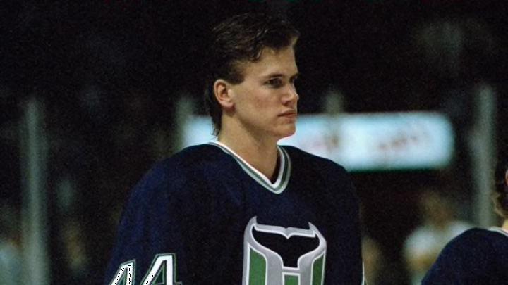
After moving from Hartford in 1997, abandoning one of the best logos in sports, the Hurricanes debuted a red and black look based on the hurricane warning flag flown at beaches to let the public know not to swim in the ocean. The flag pattern around the hem stripe was a fantastic touch to the jersey, which was simple everywhere else, to not overdo things with the striping pattern. The design was simple, but spoke volumes.
After the 2007 season, Reebok took over uniforms in the NHL, and added an outline to the shoulder yoke, which detracted from the overall look. Then, in 2013, the team departed from the classic design altogether, only to return to a sublimated warning flag look in 2017. But nothing quite beats the original here, a look they shouldn’t have departed from to begin with.
Columbus Blue Jackets
2007-present White jersey
With not a lot to choose from, we’ll go with the cleanest look the Jackets have given us in their brief history. This jersey features shoulder yokes that extend all the way down the arm (with a star on the wrist, a neat little twist), and the navy stripe contrasts well with the white on the rest of the jersey. The logo has plenty of space to breathe, and the lack of a hem stripe actually doesn’t detract from the look.
The home jersey this compares to has a navy stripe on a navy jersey, which basically outlines the shoulders and arms, nor much else. It’s a design feature of the brand, but the arm striping is better fitted on the road whites. Additionally, the original Jacket’s white jersey resembles the current whites, while the navy jersey has changed somewhat. That consistency leads us to the road white being just a bit better.
New Jersey Devils
1992-2017 Red jersey
In terms of uniform history, the Devils have been the modern example of consistency. Aside from the change in color from green to black, the logo has stayed the same since their first season in 1982. Starting in 1992, the uniforms had stayed the same until 2017, and even then, the changes were relatively minor.
When you think of the Devils’ glory days, these uniforms come to mind. The simple triple stripes and black shoulder yoke to contrast to the red makes it a classic jersey that stood the test of time over it’s 25 years of use. Through the crazy 90’s, the NHL’s Reebok-ification, and until the Adidas takeover, the look hadn’t changed a stitch. The Devils didn’t even add a third jersey, just occasionally throwing back to the red and green days. This one was the modern day slam dunk.
New York Islanders
1972-1995 Original White jersey
For the first 20+ years of their existence, the Islanders had a healthy winning reputation, 4 Stanley Cups, and a very clean design for their uniforms. Blue and orange work well together as both complimentary colors, as well as the colors of the New York City flag. The logo was a simple one, with the I in Islanders pointing to the exact location of the Nassau Coliseum on Long Island. Then after a brief bout with fish sticks, the team gradually returned to the look full time.
The Islanders have lately been known to push the envelope with alternative looks, and usually have seen it blow up in their faces. But their classic look was much cleaner and easier on the eyes in the original days (and I guess now, that they returned to the look almost exactly). My personal preference is for the white jersey, where the logo and colors seem to stand out just a bit more on the white background. Can’t hurt to see a picture with that jersey and a Stanley Cup.
New York Rangers
1947-1976 Blue jersey
The Rangers have had an amazing jersey set for the better part of their history. For a couple of seasons, they had a college style arched name and number look, and for some arcane reason, they mirrored the Winnipeg Jets for a couple of seasons in the 70’s. But after each experiment, the Rangers returned to their classic look, with the Broadway Blue shirt, team name diagonally across the chest, red text drop-shaddowed in white, and the classic looking tie-down collar.
The road jersey the team sports is also wonderful, with a unique shoulder yoke treatment, and the same classic text design on the front, but the reason we’re going with the blue look here, is that the team is alternatively known as the Blue-shirts. The Rangers currently wear the same design as the design we have featured here, which goes to show how good this jersey really was.
Philadelphia Flyers
1967-1981 Original Orange jersey
The Flyers were the first team to wear orange as their main color since the 1931 Philadelphia Quakers (yes, they really existed), and almost immediately made it known that orange is their color. Their original orange jersey featured a unique shoulder treatment, with a gradually widening white yoke that made it’s way down the sleeve. The jersey looked obnoxiously in-your-face, which is the exact style of hockey the Flyers played.
The jersey was so appropriate for the Broad Street Bullies, that the jerseys were copied in the movie Slap Shot for the Syracuse Bulldogs, worn by goons such as Andre “Poodle” Lussier, Clarence “Screaming Buffalo” Swamptown, and of course, Ogie Ogilthorpe. These jerseys were perfectly fit for a team that’s goal was to intimidate, and the colors worked perfectly. Nowadays, the Flyers have returned to the look, including a different colored nameplate (a nice touch). Another example of a team returning to it’s roots, rightfully so.
Pittsburgh Penguins
1986-1992 Black jersey
After beginning life wearing different shades of blue, the Penguins joined their Pittsburgh brethren, the NFL’s Steelers and MLB’s Pirates, in wearing black and yellow. The change in colors was actually protested by the Bruins, but nothing came of it. In the following years, the Penguins lifted the Cup a couple of times with names like Lemieux and Jagr wearing some really good looking threads.
The main color being black is appropriate, and the yellow sleeves and a unique style of striping down the arms allowed the Penguins to make the look an instant classic. The team later switched to Vegas Gold instead of yellow, and rode that for a few years until returning full time to the look in 2016, and immediately winning a Cup with the jerseys. The proof is really in the results.
Washington Capitals
1972-1995 Original Red jersey
Though the Capitals’ best success have come in recent years, their look was more a classic in their earlier days. Washington’s first foray into the NHL was wearing a unique jersey loaded with stars everywhere, but no stars on the ice (being the worst team in league history in their inaugural season). But they looked good doing it. Red jersey with white shoulder yokes and stars in every spot they can fit, the jersey became more memorable than the teams wearing them.
In 2007, the Caps returned to red, white and blue, and wore jerseys that had elements of their original look, returning to the text based logo, and putting some stars on the jersey. But they brought back their original jersey as an alternate for a few years, and it looked just as great now as it did then. Certainly a better look than what they have now.
Central Division
Chicago Blackhawks
1955-present Red jersey
The choices for best jersey are usually easy for Original Six teams. The Blackhawks are no different. After going through their first 30 seasons with jerseys that had more stripes than a zebra, the team toned it down to a red based jersey with black and white stripes just on the hem and sleeves, and the classic Native-American head logo on the front.
The jersey was made famous by legends Stan Mikita, Bobby Hull, and Glenn Hall, and continued along to the modern day dynasty Chicago has created through Jonathan Toews and Patrick Kane. Though the team has visited other jerseys for Winter Classics (they seem to be in every other game, so they must run out soon), the best one is the jersey they currently wear.
Colorado Avalanche
1995-2007 Original Burgundy jersey
After wearing gorgeous threads in Quebec for nearly 20 years, the Avalanche took the ice wearing burgundy and blue, with unique striping reminiscent of the Rocky Mountains where the team now resides. The triangular shaped hem pattern reminds of mountain peaks, and the logo on the blue shoulders was designed after Bigfoot (or team legend Adam Foote, scholars debate).
The team tried to keep the design through the change to Reebok in 2007, but the shoulder stripes straightened out, and the hem stripe was removed. The team has returned to a similar look in 2017, but it doesn’t quite measure up to the original jersey that lifted 2 Cups in the first 5 years in Denver. It’s similar enough, though, to tell us that the team is at least trying to mend the wrong Reebok did.
Dallas Stars
1997-2007 Green jersey
The Stars were brought to Dallas from Minnesota wearing mostly black uniforms with Dallas written down the sides of the pants. But after the 1990’s did their work on the All Star uniforms in 1994, the Dallas Stars decided to take that design and wear it for their own jerseys, and created a unique set that is unmistakably theirs. The green base with the star design is perfectly done and appropriate for their team name, and was the jersey the team wore when winning the Cup in 1999.
Unfortunately, the Stars were one of the many teams hit hard by Reebok, forcing these beauties into mothballs for jerseys that were just plain boring and unimaginative. They have since righted the wrongs with a great new look, which has aged nicely and looks perfectly fine. But the Mike Modano era jerseys were much more appropriate, and looked good during an era of team success.
Minnesota Wild
2000-2013 Original White jersey
The Wild came to Minnesota a few years after the Stars left, and had a much different identity than their predecessors. They debuted with a bear head shaped logo, which doubled as a forest scene (brilliant design). They had white and green jerseys, both with green shoulder stripes going from neck to arm. The jersey looked good, aged well, and was around for the team’s first few years.
The white jersey allowed more room for the logo to breathe, and also lasted a few years longer than the green jersey, thus finding it’s way on our list. The Wild then changed to wearing red jerseys with a completely different design, before returning to green full time in 2017 when Adidas took over. But the original white jersey stands out as their best jersey to date.
Nashville Predators
2011-2017 Yellow jerseys
The Predators first started with navy and silver jerseys with yellow trim, a look they kept until 2011, when they overhauled everything. The new uniforms featured a simplified logo, a removal of silver, and a promotion of yellow from trim to main color. The jersey also featured the numbers having guitar strings running through them, a nod to country music. Their current yellow jerseys look similar, but after removing the navy accents at the top, it looks like it’s missing something.
The Preds now own the color yellow across the NHL, being the only team to wear it in a primary role. The fans in Nashville filled their home barn with yellow during their recent playoff runs, and it’s perfect for a team that’s putting it’s roots down deep in their city. Their current jerseys seem a little bland, but the overall look is fine, basing off of the most successful uniforms the team has ever worn.
St. Louis Blues
1967-1979 Blue jersey
Over the years, the Blues have had many similar looks, not changing much each time, but changing enough to notice. For years they had red in their look, but most jerseys featured blue and yellow. Their original design was the cleanest look they’ve had, however. A simple blue with a yellow triple stripe on the sleeves, and featuring the clean, classic Blue Note logo on the front.
Since then, the team has had many designs, including arching the name over the logo, red stripes, almost wearing trumpets, before settling on a clean look in 1998. The Blues have since brought this jersey back as a Winter Classic jersey, before naming it their heritage jersey this past summer. Goes to show that many teams just get it right off the bat.
Winnipeg Jets
2011-present Original Blue jersey
The Atlanta Thrashers wore the most unique jerseys in hockey when they packed up their bags north to Winnipeg. The new version of the Jets started wearing brand new uniforms and logos, featuring tributes to the Royal Canadian Air Force, where the team gets it’s name inspiration from. The jerseys are navy blue, with light blue stripes, double on the sleeves, and single at the hem.
The current Jets don’t technically share their history with the original Jets, the now Arizona Coyotes. But before the Jets played in a Heritage Classic against the Oilers, the team wore throwback uniforms similar to that of the original Jets. But again, as the team has technically nothing to do with those Jets, we’ll go with the better looking of the two jerseys the team has worn in its brief history.