NHL Power Rankings: Remembering the ugliest jerseys in history
Over NHL history, lots of teams had put out less than stellar uniforms. This week’s NHL power rankings looks back at the ugliest in history.
In the past, we’ve looked at each team’s best, most iconic jersey they’ve ever worn. It was a fun trip through time where we saw the best that jersey designers had to offer. There were lots of great jerseys in history, where teams were looking their best at the best times each team has had. We’re going to be looking at the opposite end of the spectrum in this week’s NHL Power Rankings.
For every good jersey, we’ve seen a jersey that makes us scratch our heads. We have weird logos and questionable designs. We have long pants, and whatever the heck happened in the mid 90’s. Some of these infamous sweaters even have their own nicknames, which tells you that it’s some kinda terrible.
More from Puck Prose
- Detroit Red Wings 2023 Rookie Camp Has Plenty of Ups and Downs
- This Columbus Blue Jackets rookie doesn’t want to be forgotten
- 2 trades the Boston Bruins must make to secure the Stanley Cup
- 3 reasons the Avalanche won’t win the Stanley Cup in 2024
- This is a big year for Alex Turcotte and the Los Angeles Kings
This post will be in the title belt format. One jersey holds the crown until another one takes the cake. Mind you, this is not a title they intended to hold when they unveiled their jersey to the hockey world.
We will be looking at many teams that no longer exist. Don’t worry, all information is correct, so before you ask yourself if there actually was a team called the Cleveland Barons in the NHL, yes there was, all teams mentioned here existed at one point.
For all images, we will be using pictures from nhluniforms.com, a great site that is a database for all teams’ jerseys throughout the year, documenting every single change over the years, down to number fonts and sock patterns. Check them out, it’s a great site for hockey history.
Without further ado, it’s time to look at some of the ugliest sweaters the NHL has ever seen.
Toronto Arenas: 1918-19
The NHL started operations as a four-team league, and was one of a couple of leagues to challenge for the Stanley Cup. The number of teams in the league dropped to three almost immediately when the Montreal Wanderers’ arena burned down after just six games.
The three remaining teams in the NHL in 1918 were the Montreal Canadiens, Ottawa Senators (no relation), and the Toronto Arenas. Each team had just one jersey, so there were just three jerseys to pick which one is worst. This will be the last time you’ll see the Canadiens mentioned as contenders, as their design is gorgeous and timeless. Ottawa’s classic barber-pole design wasn’t pretty, but it was a steady look that worked while the team was winning.
The Arenas started NHL life with a plain blue sweater with a big T on the front. Yawn. By default, this was the worst jersey in the league. What did the team do to improve things the next season? Added stripes to the arms (good move), and the team name to the front. Why is that a problem? They kept the T there, so the front of the jersey actually spells “Aretnas, not Arenas. Yikes. The Arenas solved the problem by changing their name and colors to the St. Pats in 1919.
1919-1920 – Quebec Bulldogs
In 1919, the NHL arrived for their first of two forays in Quebec City, with the Bulldogs. This added a fourth option for ugliest uniform, and Quebec took the cake by just dressing in blue and white stripes. No logo, no lettering, just blue and white stripes. Another yawn. After the 1919-20 campaign, the team succumbed to the financial trouble that kept it out of the league during the first two NHL seasons and moved to Hamilton. Speaking of which…
1920-1925 – Hamilton Tigers
Sunglasses may be required here, fair warning. The Bulldogs left their blue and white duds behind in favor of these yellow and black striped sweaters with a tiger on the front. I personally have a couple of issues with this look, but the main one is that tigers aren’t yellow. Look at any famous tiger, such as Tony the Tiger, Tigger, or Hobbes, or real life tigers, they’re orange, not yellow.
Now, I get the idea that while the color is off, the stripes are enough to represent the tiger effectively. Fine, I’ll give them that. The design of their jersey changed over the few years they were in existence, with their last jersey not actually looking awful, but they were still easily the worst looking jersey in each season.
The Tigers actually were good in that last season, but due to the players striking for more money, the entire team got suspended, and almost immediately thereafter, folded. This paved the way for one of the kings of the ugly sweater.
1925-1941 – New York Americans
Contrary to popular belief, the Rangers weren’t the first NHL team in New York. In fact, they weren’t even the first NHL team to call Madison Square Garden home. The Americans came to the Big Apple the season before the Rangers did, and they arrived in style. Keeping true to their name, they wore the most patriotic looking sweaters ever seen on planet Earth. Stars and stripes appeared everywhere there was space for them. This being a team called the Americans, subtlety was appropriately ignored.
The Americans changed their uniforms up a few times over the course of their history, which included the first instance of names on the back of the jersey, stars arching over the front and back, and copycatting their neighbors. None of which was particularly pretty, but at least it stayed true to their brand of being good ol’ fashioned American.
Meanwhile: The Pittsburgh Pirates picked up some hockey sticks and hideous colors, the Detroit franchise wore yellow, and the Boston Bruins dressed in football sweaters. Speaking of which…
1941-1948 – Boston Bruins
In a horrible turn of events, the Boston Bruins decided to put their jersey numbers on the front of the jersey, the same size as the one on the back. To those of us who know a thing or two about hockey uniforms, this looks like two backs of the same jersey as opposed to the front and back of one.
This looked more like it belonged on a football field than it does on an ice rink. The Bruins actually had this design for a few years before taking the title belt, but because of the Americans, this didn’t become the worst until the Americans folded.
The Bruins would keep this look until 1948, where the first appearance of the Spoked-B came around (which was actually just an anniversary logo at the time). Once the Bruins came to their senses, the team looked just fine from here on out, and would no longer be doing anything silly with their uniform set (for the most part).
Meanwhile: The Chicago Black Hawks did the same football thing with their road white jersey, and the Rangers went to a wording style we usually see in college for a season before returning to their classic style for what we thought would be the last time.
1948-1955 Chicago Black Hawks’ Barber-pole
Here’s the part of the story where it’s difficult to determine the ugliest jersey. The Original Six Era, which the period of time between the Americans folding and the 1967 expansion is called, is a very good looking part of NHL history, where not many teams had issues with their dress code. Picking a team for this era is unfair, because each of the six teams evolved into more or less what they’d wear for the rest of their history.
We picked the Black Hawks here because that black jersey is not what they wear now, and is kinda hard to look at without getting lost in the stripes. These stripes have changed here and there over the course of it’s time as the primary jersey for the Hawks, but the design predominantly stayed the same.
Meanwhile: Yeah, everyone else looked fine. Nothing to question here.
1955-1967 – Boston Bruins White Roads
As mentioned above, none of the above jerseys actually look bad. In fact, this Bruins set looks quite good. I picked the Bruins for this era because they are the only team for this period of time who don’t look almost identical to today’s iterations of the same jerseys. I picked the white jersey of this set almost arbitrarily.
Again, this jersey didn’t stay exactly the same over the course of it’s reign here, but really not much did at this time.
Then 1967 happened, and the hockey world started rapid expansion. With rapid expansion came six new jersey sets to look at.
Meanwhile: Nothing silly. The fun is about to begin.
1967-1976 – Whatever the Oakland/California Golden Seals were doing
1967 brought six new teams in to play, including the Flyers, Penguins, Blues, Kings, North Stars, and Seals. Who are the Seals? I’ll tell you who the Seals were. Because the NHL was expanding into Los Angeles, logic dictated that a second team be put in California for the sake of travel expenses, so Oakland was given a team.
The Seals debuted with their logo consisting of a multicolored blob (the Seal) on a hockey stick in a C, on green and blue jerseys that didn’t look good together. Half the season in, the team name changed to Oakland, and the C was simply closed.
In 1970, Charles O. Finley, the crazy guy who owned the Oakland A’s, bought the Seals and renamed them the California Golden Seals, and dressed them in his favorite green and yellow (and white skates).
Green and yellow works wonderfully with the Oakland A’s. Also is perfect for the Green Bay Packers. Even expansion-mates Minnesota looked good. Here? Not as much. Now, these aren’t terrible, but they were easily the worst in the league to start the 70’s. Then 1974 came around, and we realized the worst had yet to come.
Barf. After Finley sold the team, the jerseys and colors changed. Turquoise and yellow together isn’t good, and the hoops around the arms are thankfully unique in NHL history. This look stuck around for three seasons and somehow the owners thought it was fine. It worked so well, that in 1976 the team was moved to Cleveland to become the Barons.
Meanwhile: The Penguins debuted in two shades of blue, rather than the black and yellow we know, and the Rangers made a humongous mistake. More on the latter below.
1976-1978 – New York Rangers’ humongous mistake
If there’s ever been a face-palm worthy uniform decision in NHL history to this point, this is it. The Rangers had a classic uniform, with the team name written diagonally across the chest, a design that they have owned throughout history (and has been imitated briefly by two other teams at points in time). They put those aside for these monstrosities.
No other time in Rangers history (save that one Winter Classic) did they use the full logo on their uniforms. Not that it’s a bad logo, far from it, but that logo doesn’t belong on the front of their jerseys. On top of that, the entire jersey changed from the classic design they made their own to one that looks more at home on the Winnipeg Jets or Columbus Blue Jackets (neither of whom would exist for several years). Finally, the number font is bland and looks typed on in Microsoft Paint. The Rangers would come to their senses and return to what they have now, and let’s never speak of this again.
Meanwhile: The Penguins wore navy jerseys and ignored yellow despite their logo. They really needed some time to get things right.
1979-1991 – Vancouver Canucks Flying V’s (and their smoldering remains)
Hoo boy. Where do we begin?
The Vancouver Canucks joined the league in 1970, wearing perfectly fine blue and green uniforms, which was appropriate for their locale in the Pacific Northwest. The team asked a design firm in San Francisco to design something more aggressive than what they were wearing, and this is the result of that. Aggressive isn’t the word that comes to mind.
Looking at this jersey, you’ll see the letter V all over the place, and a color combo of yellow/black/red, which isn’t ugly on it’s own (look at team Germany), but after settling into a blue/green look, it’s a bit shocking. The final product looks like something out of a sci-fi setting (Star Trek comes to mind). In fact, the team was wearing these uniforms in the 1982 Stanley Cup Finals, led by a goalie named Brodeur (no, not that one). Imagine someone lifting the Cup wearing these uniforms. After that, look at this picture of puppies to get your mind off the possibility.
The team would start gradually shaving features off the infamous uniforms, starting in 1985 (yes, that set lasted close to a decade). The residual effects of that uniform carried the crown until 1991, at which point the team had come back to a relatively normal looking set, which would last until 1997. Blue/green didn’t return full time for another decade.
1991-94 – Minnesota North Stars’ foreshadowing
The North Stars had a great look when they joined the league in 1967, with a simple logo and great green/yellow look. Black starting mixing in during the 1980’s, until here in 1991 where the team went full black. Any usage of North here was removed, in kind of a foreshadowing move for their upcoming relocation to Dallas after financial problems in Minnesota.
The jersey itself isn’t so bad, despite a few issues, such as the stripes around the arm disappearing, and green numbers on the black background. In fact, Stars legend Mike Modano was seen wearing this jersey in the movie Mighty Ducks.
The team moved to Dallas, and this jersey stuck with them. The team would later switch to their famous Star-shaped jersey, which was excellent.
Meanwhile: Not a whole lot to complain about. This can be considered the quiet before the storm. The 1990’s were about to get into full swing.
1994-95 – St. Louis Blues and angular numbers
In the first step of the mid 90’s aesthetic disaster, the Blues decided it’d be a good idea to add red to their classic blue/yellow color scheme, and to angle the bottom of the jersey numbers on the back to groove with the striping pattern. Well, in all honesty, it was close to being much, much worse. But this isn’t good. The red of the jersey catches more of the eye than the blue does, which is fine if your team is the Reds, but these are the Blues, so yeah.
But on the whole, this jersey isn’t so bad, compared to what we’re about to see.
Meanwhile: The Calgary Flames add a sheath to their striping pattern while overhauling a classic look.
1995-1998 – New York Islanders’ Fisherman jerseys
Oh God why.
When joining the NHL in 1972, the Islanders wore a very solid uniform set that aged perfectly fine. Blue and orange worked well together, as it does for the Mets and Knicks in town. Then 1995 happened, the front office and roster was completely gutted, Mike Milbury was hired as a coach, and these uniforms came out. The Islanders quickly went from respectability to a laughingstock.
The color scheme added teal and silver, the number font and striping pattern lost all common sense, and the logo looked like the same guy that Gorton’s seafood company uses in their logo. Everyone universally hated this jersey immediately, and demanded the old design back (which only took until 2010 to fully recover, because logic).
The team replaced Gorton with the classic logo in 1996, and returned to normal looking jerseys by 1998. But if you think they learned their lesson with bad jerseys, you’ll soon find out they didn’t.
Meanwhile: The NHL installed a third jersey program, which put out some of the legendarily bad uniforms in league history. Included in this is Anaheim’s Wild Wing, Boston’s Bear Face, Los Angeles’ Burger King, Pittsburgh’s Robo-Penguin, and whatever you want to call this Vancouver jersey. Additionally, Tampa Bay added a rainstorm to their jerseys, and Buffalo released their Goat-Head logo onto the world. The 90’s are fully underway.
1998-2006 – Ottawa Senators’ Red-plus jersey
The second coming of the Ottawa Senators saw significantly tamer uniforms than the first team, which was decked out in barber-pole red/white/black. The Senators you now know were dressed in perfectly decent uniforms with a centurion logo on the front. Great.
In 1997, the team introduced a wild alternate uniform, with a red base and a black/white hill going through it. The head in the logo now faces forward, and the number font changed to a more modern typeface. For an alternate jersey, it’s nothing out of the ordinary for this time period, though still ugly. Inexplicably, this jersey became the team’s regular dark jersey in 1999, and they kept their old design for the white, deciding that brand consistency wasn’t really that important.
This jersey held on until the age of Reebok came out, causing this design to mercifully cease to exist. While Reebok doing this was a good thing, there were other concerns on the horizon.
2006-2008 – Buffalo Sabres’ Buffaslugs
As the age of Reebok was about to dawn, the Buffalo Sabres knew they had an opportunity to change things up. Their Goat-Head logo and red/black/silver color scheme wasn’t doing it for them, at least not nearly as well as their classic blue/yellow look they scrapped to get there. So the Sabres did what was perfectly reasonable, and created a design that didn’t look anything like their classic jerseys.
In fact, the Sabres’ new logo looked like a slug with a bison head, and the Buffaslug nickname was born. The uniforms weren’t much better, with stripes and panels everywhere, resulting in a very busy design. They did institute numbers on the front corner of the jersey, a brand new feature at the time, and still carries over to today. The design carried over into the Reebok Edge format, and looked none the better for it. For the fans, hey, at least it was mostly blue and yellow, right?
The team rectified this and returned to their classic design in 2010, albeit in navy and not royal blue. Can’t get ’em all, I guess.
2008-2011 – Atlanta Thrashers trying football
The Atlanta Thrashers were the NHL’s second adventure in the city, after the Flames flamed out and moved to Calgary. The team was named after the state bird, and their two logos looked like a cereal bowl with a spoon, and a capital Y. They came out with a very fascinating alternate uniform back in 2003, where they figured symmetry isn’t really a thing, and wrote Atlanta down the left sleeve. This design must’ve gone over well, because it was their home uniform for the remainder of their time in Atlanta.
When it came time to making another third jersey, it’s symmetry wasn’t called into question, but everything else was. Awkward sleeve patterns, the bird head logo as a shoulder accent, the weird piping at the bottom of the sides, and most prominently, the front number existing at all, let alone being huge. The text above the numbers is too similar a color to the jersey itself, and blends in, leaving it to look like a college football jersey.
We thought this lesson was learned in the 40’s and 50’s, that football-like jerseys in hockey are ugly and shouldn’t be used ever, and Atlanta, ever shamed at the fact, moved to Winnipeg before fixing this atrocity. Thus, the football jerseys were eradicated from the NHL…for about four months.
2011-2013 – New York Islanders try again
We thought the football trend had run its course, but the Islanders gave it one last hurrah before it went away for good. Like what happened in 1995, the team decided that their perfectly good blue/orange regular uniforms weren’t enough (they had just switched back to these full time just one year previous), and decided to get back into that new uniform thing. Too bad someone forgot to fire that designer after the fish sticks debacle.
In a similar fashion, the team added two colors from out of left field, except they are both far more prominent, and far less attractive. Black and gray went everywhere, the football treatment appeared, and the bottom of the jersey along with the pants together make a diamond pattern, which clearly mattered to the designers for some reason. You could see how well it fit with the rest of the look, thus garnering disgust from everyone, excluding the designer.
The team had to keep this stinker for the minimum three years, and we hoped that the Islanders learned their lesson a second time, and stuck to their classic blue/orange combination.
Meanwhile: Remarkably, these two years were status quo, and very few teams actually unveiled new uniforms. Maybe they figured that over-designing things wasn’t such a good idea, even for a quick cash grab attempt.
2013-15 – Buffalo Sabres’ Turd Burger
Oh Buffalo. You came so close to fixing things up for good. Buffaslug was put out to pasture, the old logo and design returned, and we can forgive the silver piping and armpits. The look was fine for everyone involved. Then this third jersey was unveiled. At least this wasn’t a regular jersey.
The design was unique to the NHL (thankfully), with yellow on the front, blue on the back, and the city name just above the front logo. Additionally, not seen here, the captaincy letters actually were positioned on the shoulder, rather than the upper left chest where they traditionally go (upper right in Detroit). Silver became more prominent on the sleeves and numbers, and white stripes went down the arms and stopped mid-collarbone. All this led to social media immediately making fun of it, to the point where Sabres president Ted Black said, “If it’s a turd burger, I’ll have to put it on a bun and eat it.” Quotable quote.
The Sabres got rid of the jersey in 2015, and not a moment too soon. The team has yet to visit the realm of an alternate jersey since.
2015-2017 – New York Islanders’ attempt at brand synergy with the NBA
As mentioned before, the Islanders don’t learn very quickly and attempted to use another alternate jersey that had colors on it that weren’t blue or orange. In fact, the only not black/white feature on this uniform were the orange strips of tape on the NY logo. This was an attempt at brand synergy with the Brooklyn Nets, the basketball team who plays in the Barclays Center, one of the homes of the Islanders.
The jersey isn’t abjectly horrible. In fact, it actually fits well with their attempt at being the hockey version of the Brooklyn Nets. But, it doesn’t fit at all with the Islanders’ brand, which creates a spot for itself on this list. Another idea could be that this is the NHL’s lone attempt at creating a uniform set that jives with the NBA’s City Jerseys.
The Islanders had these uniforms for just two seasons before Adidas took over, also coinciding with the team’s announcement of their eventual departure from Brooklyn.
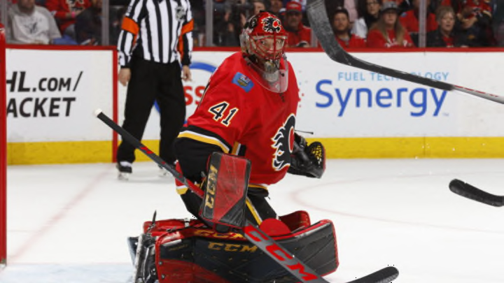
2017-present – Calgary Flames
The Flames were one of the teams that was hit hard during the age of Reebok. The team had piping and striping along the sides and armpits of the design that made the jersey look very busy. Additionally, the striping pattern stopped halfway up the side, which made it look like they weren’t done filling it in. Another issue was the black number font on the red jersey, but the real issue is black being there at all. Finally, while it’s a nice touch, I’m not sold on using the Canada and Alberta flags on the shoulders.
The team fixed the problem of the underarm piping mess when Adidas took over, but the underarm piping being there at all is still not pretty. They also hadn’t fixed any of the black being there at all. The look isn’t really bad, but it’s the worst the NHL has right now.
The Flames have a gorgeous throwback alternate uniform, and it would be excellent as a full-time jersey. Why they don’t use it as such is beyond me.
So there you have it. The current ugliest uniform the NHL has to offer belongs to the Calgary Flames. While it’s nothing compared to the Flying V, Fishsticks, or Turd Burger, it’s got a place on this list just like the others.
In my opinion, the trophy for the ugliest uniform to ever exist belongs to Vancouver for the Flying V jersey. It was truly ugly, and lasted way too long. At least some of the other atrocities were taken care of quickly.
What’s your pick for the ugliest uniform ever made? Was it mentioned here? Feel free to drop a line in the comments to make your case. This is subjective, so you can’t be wrong.