The wait is finally over with the NHL having carried out a full reveal of the #ReverseRetro Jersey range.
After weeks of tantalizing teases across social media, we can finally feast our eyes on the #ReverseRetro range by the NHL and Adidas.
And, boy, are there some absolute doozies in that collection.
More from Puck Prose
- Detroit Red Wings 2023 Rookie Camp Has Plenty of Ups and Downs
- This Columbus Blue Jackets rookie doesn’t want to be forgotten
- 2 trades the Boston Bruins must make to secure the Stanley Cup
- 3 reasons the Avalanche won’t win the Stanley Cup in 2024
- This is a big year for Alex Turcotte and the Los Angeles Kings
Designed as a play on all 31 franchises’ throwback jerseys but with a distinct modern twist, the new uniforms combine beautiful nostalgia, cherished old logos and some absolutely stunning old school looks.
With the overall design process taking about two years, each jersey represents a remixed throwback to a season that holds some historical significance for each team in the National Hockey League, and each team will wear the striking jerseys on multiple occasions throughout the 2020-21 season in designated rivalry games.
You can’t help but stare at some of these jerseys for hours given the sheer beauty of a vast amount of them, and it is feasible to predict that these will prove hugely popular across the board.
There are some notable highlights, however, and it is fair to suggest that the Pacific Division hit it out of the park with their collection of #ReverseRetro Jerseys.
REMIXED TO PERFECTION 🙌@adidashockey brought the 🔥 with these #ReverseRetro jerseys. pic.twitter.com/zfmPuSS6bB
— NHL (@NHL) November 16, 2020
From the Anaheim Ducks bringing back the iconic “Wild Wing” jerseys to the LA Kings really throwing it back to the glory days with a beautiful purple and gold jersey that honors the Wayne Gretzky days, the Pacific is going to look very sharp out on the ice in 2020-21.
I also really like the Boston Bruins’ decision to remix their jerseys from 1988 and 1990 Stanley Cup Finals with a striking yellow look, complete with a bear head logo on the shoulder patch.
— NHL (@NHL) November 16, 2020
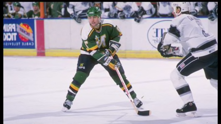
The Carolina Hurricanes made the decision that makes the most sense by throwing it back to the Hartford Whalers’ inaugural season but swapping in gray for white, while the Minnesota Wild’s #ReverseRetro jerseys look really neat with the Minnesota Northern Stars’ color scheme.
However, the clear winner for me is the Colorado Avalanche who went with an absolutely breathtaking white jersey complete with a maroon Quebec Nordiques logo, making it the pick of the bunch.
Our past, our present, remixed for Avs Faithful.
— Colorado Avalanche (@Avalanche) November 16, 2020
Introducing the Colorado Avalanche adidas #ReverseRetro jersey. Hitting the ice in 2021.#GoAvsGo https://t.co/zNgLmLDowQ
The one major disappointment is the New York Islanders, who opted to basically change the shade of their normal home jersey and that was pretty much it. I mean, I get that General Manager Lou Lamoriello likes boring and everything straight down the line, but this was a real missed opportunity.
I mean, look at their rivals the New York Rangers who listened to their fans by bringing the hugely popular ‘Lady Liberty’ back, and being a Blueshirts fan myself I can attest to the fact that those jerseys will fly off the shelves.
The Vegas Golden Knights also did a nice job of honoring teams that paved the way for their existence, including the Las Vegas Thunder with a really neat red jersey complete with the Knights’ black and gold color scheme in there.
Overall, the decision to remix the past and come out with these beautiful #ReverseRetro Jerseys is a smart one by the NHL given hockey fans’ love for nostalgia, and these uniforms should prove hugely popular.
The next step is to actually see them in action out on the ice.
And, the team here at Puck Prose will be conducting power rankings of the #ReverseRetro Jerseys, Division by Division, so stay tuned!
