The Pacific Division’s Reverse Retro jerseys are the best around.
Subjectively speaking, the Pacific Division may be the sharpest dressed in the NHL.
Will I get some pushback for that statement? Eh, maybe so, but really think about it, is there a single bad look in the bunch?
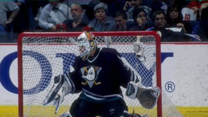
Sure, one could quibble over whether the ‘new’ Anaheim Ducks logo is as cool as their former look, if red is the right color for the Arizona Coyotes, or whether or not Blasty deserves a return over the flaming C of Calgary, but without throwing any other teams under the bus, it’s safe to say the NHL’s westernmost division knows how to put together a good ‘fit.
More from Puck Prose
- Detroit Red Wings 2023 Rookie Camp Has Plenty of Ups and Downs
- This Columbus Blue Jackets rookie doesn’t want to be forgotten
- 2 trades the Boston Bruins must make to secure the Stanley Cup
- 3 reasons the Avalanche won’t win the Stanley Cup in 2024
- This is a big year for Alex Turcotte and the Los Angeles Kings
With that in mind, should we really be all that surprised that when the league announced their latest endeavor into fashion, the Reverse Retro jersey, that all eight members of the West are very well represented?
Seriously, there isn’t a single bad, or even meh jersey in the bunch, with all eight serving as solid additions to anyone with a spare $180 (at minimum) lying around.
But which one is best? Well, if you want yet another opinion on the subject, who am I to argue? I mean, you did click on this article expecting… something, right? Why not give the people what they want.
Born from the City of Vegas. Introducing the Vegas Golden Knights adidas #ReverseRetro jersey. Hitting the ice in 2021! pic.twitter.com/jrJAmwOupf
— 🏆 - Vegas Golden Knights (@GoldenKnights) November 16, 2020
If the Vegas Golden Knights were a college student, they’d just be realizing that maybe they should have taken one of those summer internships after all.
With only three full years of history under their ‘franchisanal’ belt, it’s borderline impossible for the Golden Knights to put together a legitimate retro jersey of any kind. I know 2017 feels like a lifetime ago, especially when you factor in the seemingly endless dredge that is 2020, but in actuality, the only substantive change Vegas has made to their hockey team is its name, which happened very early on in the process.
Therefore, the Golden Knights had to look a little further into the past to find a viable vintage look, and the results, to be fair, are pretty good.
Inspired by the Wranglers, who played in Vegas from 2003-2014 and the Thunder, who “graced the strip from 1993-1999”, the jersey is a tad too ‘Captain Marvel’ for my tastes, but then again, maybe you’re a fan of Carol Danvers, so who am I to judge?
With cool gold detailing and sweet badges on the shoulders, this is definitely a great jersey, even if it’s not technically a ‘legit’ retro.
Brewed with #OilCountry passion.
— Edmonton Oilers (@EdmontonOilers) November 16, 2020
Introducing the #Oilers adidas #ReverseRetro jersey.
Hitting the ice in 2021. pic.twitter.com/5xQcOj8OyS
The Edmonton Oilers‘ jersey is, in fact, a retro jersey; it’s also relatively similar to their current away jersey.
While personally, I kind of dig the minimalistic look, orange shoulders, and white halo-ed letters, some have suggested that there are simply too many stripes on the jersey, and once you see that, it’s hard to unsee it.
Maybe if the Oilers would have taken a page out of the Anaheim Ducks’ playbook – more on them later – and gone with a surreal take on featuring their ‘Rigger‘ they’d land a bit higher on the list, but personally, I find this a great look for fans of Edmonton but nothing ‘must-have’ like, say the New Jersey Devils’ Christmas sweater, um, sweater.
