Notice how I have something to like about every jersey in this division except Detroit? This is another nice jersey. While it’s not that creative the jersey is still one that’ll catch your eyes right away because of the color scheme and unique logo.
However, that is the reason why I said it isn’t that creative because, to an extent, all the Sabres did here was just take their first-ever Third jersey, which was introduced in 2000, and slap the current color scheme on it. The original version was released with the red, black, and silver color scheme back in 2000.
Our #ReverseRetro jerseys are modeled after the red alternate sweater introduced during the 2000-01 season and worn through 2005-06, with a royal blue twist. 🤩
— Buffalo Sabres (@BuffaloSabres) November 16, 2020
Learn more: https://t.co/zBML8G5naU pic.twitter.com/SlbzkniuJm
Staring at the current iteration makes me wish they incorporated that color scheme more and more. The Sabres were the perfect team to accompany the LA Kings idea of mixing two different eras together. They mixed the Gretzky era with the original colors. I think it would have been cool to use the current Sabres logo, use the aforementioned color scheme and then use a different era logo for the shoulder patch, but then again this is me. Overall, I like this jersey a lot.
The “Buffaslug” would have looked great with the old color scheme in my opinion as well.
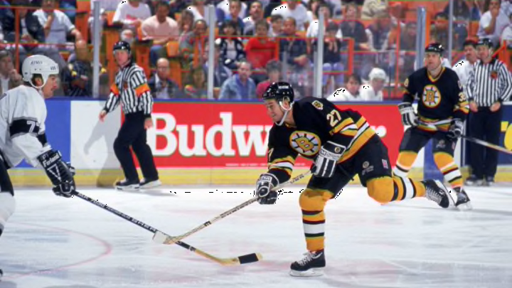
Boston’s Retro Reverse jersey is pretty cool as it makes the top half of my list. As someone who likes to dress vibrant and bright most of the time, I would instantly add this to my jersey collection. I love the decision to go mainly yellow, something that Boston hasn’t done since the 2010 Winter Classic.
As a jersey that has been used multiple times, they haven’t gone fully yellow since the infamous “Winnie The Pooh” alternate released in 1995. This new alternate is based off the Bruins jersey that was used during 1981-95. They made the Stanley Cup Finals twice during that era.
A nod to '90.
— Boston Bruins (@NHLBruins) November 16, 2020
More #ReverseRetro photos ➡️ https://t.co/7CMxTulPzE pic.twitter.com/A6muv8gyYw
They switched the main color from black to the aforementioned yellow and it looks great. I like it but there are a couple of minor things I would change. Firstly, the bear shoulder patch logos, I would have reversed the color scheme on that logo, giving the head a main color of black and the lining all over the face yellow.
It would make that specific part of the jersey stand out, especially on a light background. The second thing I would change is the striping. It’s fine but the middle yellow stripe would be changed to gray. Like I said, I love the color but there is a thing as too much of a color. I would throw in that one gray stripe to somewhat balance out the contrast between light and dark. Other than that, this is great.
As a Panther fan myself I like this, but at the same time, I’m a little disappointed. However, I do understand that Florida doesn’t have an extensive jersey history and they brought back the leaping Panther.
They should have never changed that logo and this jersey proves that. This has the potential to be one of the better selling jerseys out of this new collection simply because of the logo. To be honest, that is the reason why it is so high up the list for me. They also get points for not stripping details like the Red Wings did but that is about it.
All in all, what the Panthers did was just take their navy blue jersey, which they wore from 1998-07 and make a few tweaks. If you already have that one then you really wouldn’t feel inclined to buy this one. They just changed the yellow of the old version to the flat gold they have now and changed up the array of striping on the bottom and the sleeves.
Your Colors. Your Retros. Remixed. The #FlaPanthers adidas #ReverseRetro jersey available 12/1. pic.twitter.com/vt8G6AZia2
— Florida Panthers (@FlaPanthers) November 16, 2020
It is a nice jersey but I think this would have benefited from a color swap like the other jerseys. Maybe this would look even cooler with gold as the main color, but this is what we have. If the team would have embroidered a rat on the front-upper left corner this probably would have been even better than what we got.
Florida took a if it ain’t broke don’t fix it approach, but I would have loved a bit more creativity. Overall, not bad but it could have been a little bit better.
