Power Ranking The Atlantic Division Retro Reverse Jerseys

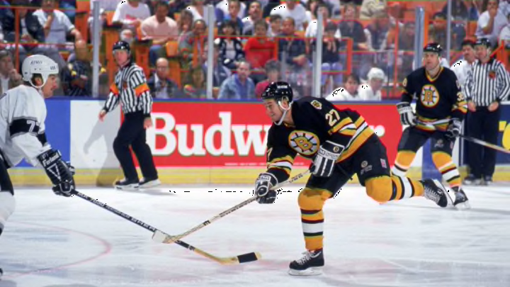
Right wing Dave Christian #27 of the Boston Bruins. (Photo by Ken Levine/Getty Images)
3 of 3
Next
Right wing Dave Christian #27 of the Boston Bruins. (Photo by Ken Levine/Getty Images)
Right wing Dave Christian #27 of the Boston Bruins. (Photo by Ken Levine/Getty Images) /

It is time to Power Rank the newly-released Retro Reverse jerseys in the Atlantic Division.

We have already given our thoughts on the Retro Reverse sweaters in both the Pacific and the Central Division, and today we’ll judge the best and the worst in the Atlantic Division.

Let’s delve right in!

Detroit Red Wings. 8. team. 72. . .

According to the NHL this jersey is inspired by the ones worn when the Red Wings won their ninth Stanley Cup Championship back in 1998 and the ones worn in the Centennial Classic back in 2017.

Um, okay.

All they did was just take the regular Red Wings road jersey and removed every element of red from it. They removed it from the shoulders and the sleeves and they just changed the stripes to gray to accommodate the Centennial Classic look.

Out of all the teams this has to be the most uncreative, unimaginable, and lackluster jersey in the whole Retro Reverse collection. I get it. Detroit’s jerseys have largely remained the same since they changed their name from the Falcons to the Red Wings before the 1932-33 season.

However, you can’t convince me for one second that this was the best they can do. This is absolutely disappointing for me and I’m sure for a lot of other people who aren’t Detroit fans. Laziness is the word that best suits this look.

What they should have done was take a few elements from a few of the jerseys they wore on special occasions and mix it with the Detroit Cougars “D” in the middle. Then I would’ve added the iconic winged wheel on both shoulders. If I had to give this a grade I would give this a 1 out of 5 and even then that’s me being generous.

team. 116. . . . Toronto Maple Leafs. 7

Now this is more like it! To me it’s not good enough to make the top half of the list but this is more creative than the Wings jersey in my opinion. This look is based off the early 1970’s style. They took the 1969-70 jersey and made a few notable changes to the striping. Unlike the Wings just changing the color of the stripe and calling it a day, Toronto re-did the striping entirely when comparing this to their actual jersey they wore in 1969-70.

They took out the pattern used in those jerseys and replaced it with a thicker and bolder gray stripe on the bottom. Since it’s not mixed in with white you can actually see it a lot more clearer than Detroit’s disaster. They also added in a long and thick gray stripe down each sleeve, starting from the shoulder which the original didn’t have.

I love how they also added two blue leafs on each shoulder as well. Again, that is something that the original jersey didn’t have. However, the reason I put it at number 7 is because, well, it is a Leafs jersey.

Don’t get me wrong, it is nice but it is almost similar to every other iteration of the famous classic look. However, I still like it. The only thing I would change is turning the logo in the center of the jersey to white to help it stand out more from the blue background. It’s also worth noting that the gray idea comes from the Centennial Classic of 2017 as well.

. . . Tampa Bay Lightning. 6. team. 23

As a Panthers fan, I like this. This specific era that this jersey is inspired by is one of my favorites of all time. I wish the Lightning still would have been using this logo as their primary one but at least they brought it back. What the team essentially did here was take the 2004 design, the year they won their first Stanley Cup, and gave it the color scheme which they are using today. That’s awesome, however, I would have added a little bit more black, more likely on the shoulders.

I would do that to give more of a nod to the 2004 Stanley Cup team but, overall, this is a nice look and I would definitely buy this if I could. I also love the little black and white stripes underneath the armpit. I love hidden features in jerseys.

Craig Conroy #22 of the Calgary Flames. Mandatory Credit: Robert LaBerge /Getty Images/NHLI
Craig Conroy #22 of the Calgary Flames. Mandatory Credit: Robert LaBerge /Getty Images/NHLI /

. . Buffalo Sabres. 5. team. 12.

Notice how I have something to like about every jersey in this division except Detroit? This is another nice jersey. While it’s not that creative the jersey is still one that’ll catch your eyes right away because of the color scheme and unique logo.

However, that is the reason why I said it isn’t that creative because, to an extent, all the Sabres did here was just take their first-ever Third jersey, which was introduced in 2000, and slap the current color scheme on it. The original version was released with the red, black, and silver color scheme back in 2000.

Staring at the current iteration makes me wish they incorporated that color scheme more and more. The Sabres were the perfect team to accompany the LA Kings idea of mixing two different eras together. They mixed the Gretzky era with the original colors. I think it would have been cool to use the current Sabres logo, use the aforementioned color scheme and then use a different era logo for the shoulder patch, but then again this is me. Overall, I like this jersey a lot.

The “Buffaslug” would have looked great with the old color scheme in my opinion as well.

Boston Bruins. 4. team. 70. . .

Boston’s Retro Reverse jersey is pretty cool as it makes the top half of my list. As someone who likes to dress vibrant and bright most of the time, I would instantly add this to my jersey collection. I love the decision to go mainly yellow, something that Boston hasn’t done since the 2010 Winter Classic.

As a jersey that has been used multiple times, they haven’t gone fully yellow since the infamous “Winnie The Pooh” alternate released in 1995. This new alternate is based off the Bruins jersey that was used during 1981-95. They made the Stanley Cup Finals twice during that era.

They switched the main color from black to the aforementioned yellow and it looks great. I like it but there are a couple of minor things I would change. Firstly, the bear shoulder patch logos, I would have reversed the color scheme on that logo, giving the head a main color of black and the lining all over the face yellow.

It would make that specific part of the jersey stand out, especially on a light background. The second thing I would change is the striping. It’s fine but the middle yellow stripe would be changed to gray. Like I said, I love the color but there is a thing as too much of a color. I would throw in that one gray stripe to somewhat balance out the contrast between light and dark. Other than that, this is great.

97. . . . Florida Panthers. 3. team

As a Panther fan myself I like this, but at the same time, I’m a little disappointed. However, I do understand that Florida doesn’t have an extensive jersey history and they brought back the leaping Panther.

They should have never changed that logo and this jersey proves that. This has the potential to be one of the better selling jerseys out of this new collection simply because of the logo. To be honest, that is the reason why it is so high up the list for me. They also get points for not stripping details like the Red Wings did but that is about it.

All in all, what the Panthers did was just take their navy blue jersey, which they wore from 1998-07 and make a few tweaks. If you already have that one then you really wouldn’t feel inclined to buy this one. They just changed the yellow of the old version to the flat gold they have now and changed up the array of striping on the bottom and the sleeves.

It is a nice jersey but I think this would have benefited from a color swap like the other jerseys. Maybe this would look even cooler with gold as the main color, but this is what we have. If the team would have embroidered a rat on the front-upper left corner this probably would have been even better than what we got.

Florida took a if it ain’t broke don’t fix it approach, but I would have loved a bit more creativity. Overall, not bad but it could have been a little bit better.

Brad Marsh #14 of the Ottawa Senators. (Photo by Rick Stewart/Getty Images)
Brad Marsh #14 of the Ottawa Senators. (Photo by Rick Stewart/Getty Images) /

team. 91. . . . Ottawa Senators. 2

The Ottawa Senators have made some great choices with their uniforms as of late. After showing off their new home and road uniforms for the 2020-21 season, they decided to take those and make another alternate. Simple, but great decisions. Ottawa has finally decided to go back to their original uniform design for the upcoming season. This was being asked by fans for years and to finally see it back is awesome.

It’s also awesome to see the franchise maximize their resources here. The decision to go red is great. It is the same as the jerseys now but they just switched every element to the other color. The stripes on the sleeve and bottom is now black as well as the collar. This is basic but great.

Montreal Canadiens. 1. team. 152. . .

This is brilliant. After decades upon decades, the Habs finally did something different and it is as simple as swapping colors like most other teams. For the first time ever they have a blue jersey.

ABOUT DAMN TIME!

According to the Canadiens, their Reverse Retro jersey is a mix between the ones they wore between 1974-2007 and the Montreal Canadiens jersey in 1909, when they were in the old National Hockey Association (NHA).

Overall, it’s almost the same as every other iteration of the Habs uniform but the blue really stands out. It’s super clean and basic. All the colors stand out perfectly and it is great to look at.

Next. Jeff Halpern's celebration is incredibly tone deaf. dark

We can actually say that they did something different for once.
Next