The best – and worst – jerseys for every NHL team

Fanatics
Fanatics
1 of 31
Next

Throughout the rich history of the NHL, we’ve seen some amazing uniforms. Iconic looks that stand the test of time. And then, we’ve seen some duds.

Most NHL teams have done a great job of designing uniforms. Some of the greatest franchises in NHL history have iconic looks that are right up there with the pinstripes of the Yankees. Iconic looks, that are as filled with history as they are recognizable.

On the flipside, we’ve seen some absolute atrocities. Most of these come from the 1990’s, which was the most insane decade for designing uniforms, logos and mascots.

Still, it’s a fun trip down memory lane looking at some of the best – and worst – jerseys in the NHL.

Anaheim Ducks

The Ducks wore iconic uniforms in the 1990’s and early 2000’s. Now, it’s broken out as an alternate, but it simply isn’t enough. We. Need. The. Mighty. Ducks.

Fanatics
Fanatics /

The Best: 2018-19 Alternate

Mighty Ducks forever! Another great look is the 2019-20 version, which features the 1990’s logo and the current orange and black color scheme. But for us, the king will always be the teal and purple look.

Want one? Order at Fanatics today for $179.99. 

Fanatics
Fanatics /

The Worst: 2020-21 Home

Look, we love the colors. But the Wild Wing logo just can’t match up with the old-school logo. If we were ranking current NHL uniforms, this wouldn’t be among the worst. Unfortunately for Wild Wing, it was competing against one of the most iconic looks in hockey.

Want one? Order at Fanatics for $129.99.
Arizona Coyotes

Arizona’s rebrand in the early 2000’s was undoubtedly a hit. Unfortunately, in the following 15 years, they haven’t really branched out and added anything new. That’s reflected in the rankings below.

Fanatics
Fanatics /

The Best: 2020-21 Alternate

The kachina is awesome. That’s about as deep as this needs to be, really. If there’s a downside here, it could be that the jersey is a little busy. The outer pattern tends to draw the eye away from the center logo. But overall, this look is so unique. It’s great.

Want one? Order it at Fanatics for $229.99.

Fanatics
Fanatics /

The Worst: 2020-21 Home

Like we mentioned, this jersey isn’t terrible. It just seems flat compared to the original 2003-ish design. It looks sleek, but also kind of flat. For what it’s worth, the white away jerseys look much better (maybe there’s just too much red?).

Want one? Order at Fanatics for $129.99.

Boston Bruins

One of the most iconic and historically significant franchises in NHL history, the B’s have had some amazingly classic looks and some not-so-great ones.

Fanatics
Fanatics /

The Best: 2020-21 Home

The Bruins have been rocking this look for awhile now, but if it ain’t broke, don’t fix it. To us, it’s a beautiful blend of old school and new school. The bear patch on the shoulders are an excellent touch.

Want one? Order it at Fanatics for $199.99.

Fanatics
Fanatics /

The Worst: 2019-20 Alternate

This look debuted during Thanksgiving of 2019. The solid black and block B is inspired from Bostons 1940’s and 1950’s uniforms. To us, the problem here is that they look too similar to other professional teams – particularly the Pittsburgh Pirates.

Want one? Order at Fanatics for $224.99.

Buffalo Sabres

The Sabres spent 10 years (from 1996 to 2006) with one of the strangest uniforms in hockey. But, their new alternates are some of the best jerseys you’ll find in all of the NHL.

Fanatics
Fanatics /

The Best: 2020-21 Alternate

Taking clear inspiration from their 50th Anniversary jerseys, this uniform knocks it out of the park. The gold accents make this jersey look like something really special.

Want one? Order it at Fanatics for $249.99.

(Photo by Jim McIsaac/Getty Images)
(Photo by Jim McIsaac/Getty Images) /

The Worst: Everything from 1996 to 2006

I mean, we get it. Buffalo… so, throw a buffalo on there. But, this design SCREAMS 1990’s. That’s not entirely a bad thing, but the fact that these uniforms managed to make it well into the 2000’s is absolutely wild.

Calgary Flames

The Flames haven’t really changed their colors or logos in a major way. That means most of their uniforms are relatively similar.

Fanatics
Fanatics /

The Best: 2020-21 Home

The colors pop, the logo is longstanding… is there anything else you want in a uniform?

Want one? Order it at Fanatics for $129.99.  

Rick Stewart /Allsport
Rick Stewart /Allsport /

The Worst: 1998-06 Alternate

1990’s logos were wild, weren’t they? The flaming horse demon looks like something we’d see in Lucha Libre, not on the ice.

Carolina Hurricanes

The Hurricanes have had a mixed history with their uniforms, but for our money the best design has virtually nothing to do with the franchise as currently constituted.

Fanatics
Fanatics /

The Best: Heritage

The fact that the Hartford Whalers went to Carolina is… a bummer. Obviously not for Hurricanes fans, but thankfully they extended an olive branch by embracing their heritage with these retro jerseys.

Want it? Order at Fanatics for $119.99.

Fanatics
Fanatics /

The Worst: 2020-21 Alternate

Well, we get what they’re going for. One flag is a warning, two flags means there’s a hurricane. But, the logo itself seems too narrow and oddly shaped for a jersey.

Want one? Order it at Fanatics for $249.99.

Chicago Blackhawks

Another classic NHL franchise, the Blackhawks have a history of really awesome, timeless uniforms. Our pick for “worst” might be a bit controversial, but we stand by it.

Fanatics
Fanatics /

The Best: 2020-21 Home

These jerseys have been used for nearly 30 years now, and it’s easy to understand why. They’re so clean and so classic.

Want one? Order it at Fanatics for $199.99.

Fanatics
Fanatics /

The Worst: 2019-20 Alternate

The monochromatic look is a bit unique, but ultimately this jersey is just too plain. A small touch of red would do this jersey wonders. Or maybe keep the black and white scheme, but color the center logo.

Want one? Order it at Fanatics for $169.99.

Colorado Avalanche

Colorado has been in the NHL for about a quarter of a century now – not counting the Nordiques – and have managed to do something so incredibly difficult in design. They created an alternate logo that looks like it originated at their inception. Will they be rewarded for it?

Fanatics
Fanatics /

The Best: 2019-20 Alternate

This design debuted during the 2019 season, but is still in use today. It’s easy to see why, too. This is the logo we mentioned earlier. It’s beautiful. Do you know how difficult it is to create a logo that looks retro? It’s hard.

Want one? Order it at Fanatics for $224.99.

(Photo by Doug Pensinger/Getty Images)
(Photo by Doug Pensinger/Getty Images) /

The Worst: 2009-15 Alternate

Diagonal lettering is never going to work on a uniform. Stop trying to make it work, please. On top of that, the overall design is so boring. An alternate uniform should stand out, not blend in. This was an era worth forgetting from a design standpoint.

Columbus Blue Jackets

Columbus named the franchise for the Union soldiers of the Civil War, in which Ohio played a massive role. There have been some missed opportunities to incorporate that history into the design, but as you can see below, they hit the nail on the head for their alternates.

Fanatics
Fanatics /

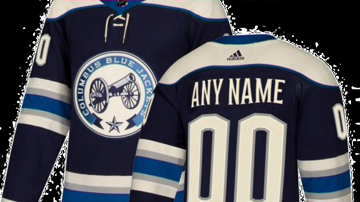
The Best: 2010-11 Alternate

The Blue Jackets have been using this alternate uniform for the last decade, and there’s no reason why they should ever retire it. From the logo to the color scheme, this jersey is amazing. The off-white makes this jersey look old school, and removing the red entirely is excellent.

Want one? Order it at Fanatics for $249.99.

Fanatics
Fanatics /

The Worst: 2020-21 Special

These jerseys took inspiration from an old prototype uniform. It was never worn by Columbus, but it was produced back in the day. But between all the red and the green-ish hockey stick, this jersey is a hard pass.

Want one? Order it at Fanatics for $79.99.

Dallas Stars

The Stars have a mixed history when it comes to jerseys. Some, like their current looks, are great. Others, like the ‘Mooterus,’ are not so great. But, there’s nothing quite like the highlighters.

Fanatics
Fanatics /

The Best: 2020-21 Home

This is a classic look. Sure, it’s a bit simple, but it’s aesthetically pleasing. The Dallas 1999-06 jerseys were a very close second-place here, mainly because we love gold. But, ultimately, we had to go with the more simple design.

Want one? Order it at Fanatics for $249.99.

Fanatics
Fanatics /

The Worst: 2020-21 Alternate

Oh, boy. The highlighters. Look, we respect Dallas for trying to think outside the box here, but this uniform needs a third color. If the highlighter green was a highlight around white numbers and letters, it would be great. But as it stands, it’s just too much.

Want one? Order it at Fanatics for $229.99.

Detroit Red Wings

A team with a rich history and a remarkably steady uniform design. You’ve pretty much got to go back to the 1930’s to see any significant changes. Still, we found a design from recent history we weren’t thrilled with.

Fanatics
Fanatics /

The Best: 2020-21 Home

These jerseys have been in use for nearly a century, so you’d be hard pressed to find a more stable design in all of sports, let alone the NHL. It’s the perfect blend of style and old-school charm. It’s iconic.

(Photo by Jamie Sabau/Getty Images)
(Photo by Jamie Sabau/Getty Images) /

The Worst: 2014 Winter Classic

The problem with these uniforms – at least in our estimation – is that it feels like it is trying to be retro, as opposed to just feeling retro. A nitpick? Maybe. But when it comes to design, every little thing takes on significant importance.

Edmonton Oilers

Fanatics
Fanatics /

The Best: 2020-21 Away

The Oilers have been using this design since 2017 – and both the home and away are great. Ultimately, we went with the away jersey, because it’s so difficult to design around orange. Edmonton does it well, but the orange highlights on the away jersey just pop in a great way.

Want one? Order it at Fanatics for $199.99.

Fanatics
Fanatics /

The Worst: 2020-21 Alternate

The Oilers have also used this alternate since 2017, but it feels like this missed the mark. From a visual perspective, this jersey is flat. It doesn’t pop or stand out in a way that an alternate jersey should. But, Edmonton should get props for trying something new.

Want one? Order it at Fanatics for $179.99.

Florida Panthers

The Panthers managed to create a 1990’s logo in the mid-2000’s, so that’s bold. Luckily, the franchise rebrand was a massive hit, creating a regal, stylish and minimalistic look to the uniforms.

Fanatics
Fanatics /

The Best: 2020-21 Away

Used since the aforementioned 2016 rebrand, these uniforms are really, really great. You’ve got a minimalistic approach, a more modern logo, and – like we keep saying – we love gold. The shoulder patches are a great touch as well.

Want one? Order it at Fanatics for $199.99.

Fanatics
Fanatics /

The Worst: 2020-21 Reverse Retro

The Reverse Retro jersey managed to clean up some of the busier elements of the pre-2016 Florida uniforms, but that jumping cat logo just can’t keep up with the new logo. We’ve lamented 1990’s-style logos in this list before, and we’re going to add ‘Jumping Panther’ to that group.

Want one? Order it at Fanatics for $179.99.

Los Angeles Kings

The Kings are rink royalty. Whether it was the modern-era or the Gretzky era, the Kings have a history of some pretty great uniforms. Still, despite being a bit of a cult classic, we’ve found one that just doesn’t work.

Fanatics
Fanatics /

The Best: 2020 Heritage

The Kings used jerseys very similar to this from 1988 to 1998. For our money, they never should have left. The center logo is a unique crest, the silver and black contrast is great, and the font is clearly Lakers-esque. It’s great.

Want one? Order it at Fanatics for $169.99.

Fanatics
Fanatics /

The Worst: 1995-96 Throwback

I mean… just… what on earth? The 1990’s were absolutely wild, weren’t they? Between the odd stripes, no center logo and the presence of five different colors, this jersey best remains in the vault. Forever.

Want one? Order it at Fanatics for $229.99.

Minnesota Wild

No North Stars jerseys here, we’re sticking solely with Wild uniforms. For the most part, it’s been minor changes. That’s a good thing, considering their main designs have been really great.

Fanatics
Fanatics /

The Best: 2020-21 Home

The Wild have been using this look since 2017, where they ditched the red uniforms (which might make an appearance later) at home. The green with red highlights is a really great look, with the gold/tan accents popping. The red adds a dangerous element (good if you’re called the Wild) and the green makes you think of nature. It’s a perfect look, particularly design-wise.

Want one? Order it at Fanatics for $199.99.

(Photo by Hannah Foslien/Getty Images)
(Photo by Hannah Foslien/Getty Images) /

The Worst: 2009-16 Home

That’s a lot of red. A lot of red can work – like the Red Wings – if the accompanying color is white or black. But all that red with all that green? Anyone else feel like decorating the tree now? Honestly, I think if they had removed the green shoulder stripes, this wouldn’t be so bad.

Montreal Canadiens

The Canadiens have been rocking their home uniform since before the first World War. It’s right up there with the iconic pinstripes of the Yankees, Dodger blue, the Celtics’ green and white. So, it should be no surprise that it appears here.

Fanatics
Fanatics /

The Best: 2020-21 Home

These uniforms have been worn since 1913. How perfect of a design do you have to create to use it for MORE THAN ONE HUNDRED YEARS?! That’s insanity. But here we are, still admiring the perfection that is the Canadiens’ home jersey.

Want one? Order it at Fanatics for $199.99.

Screenshot from Canadiens.com
Screenshot from Canadiens.com /

The Worst: 1912-13, 2009 Commemorative

The ‘barber pole’ jerseys are loved by some in the fandom, but you can’t count us in on that. When these jerseys returned as a commemorative, it was all too much. Looking at the jersey static is one thing, watching five players move around with them on is another. Hard pass.

Nashville Predators

A near-perfect Reverse Retro – and a lackluster real retro – highlight this section on the Preds. We might have the single worst color choice in the history of the NHL. Here we go.

Fanatics
Fanatics /

The Best: 2020-21 Reverse Retro

The colors pop and the reduced shadowing on the logo is a nice touch. But, the best addition to this jersey is the font changes on the back. The numbers look better than the originals. This design is sleek, but highlights the points on the sleeves, reminiscent of those sabre-toothed tiger teeth.

Want one? Order it at Fanatics for $224.99.

(Photo by Mitchell Layton/Getty Images)
(Photo by Mitchell Layton/Getty Images) /

The Worst: 2001-07 Alternate

Ah, yes, the dijon honey mustard yellow. It’s like they couldn’t decide if they wanted these to be yellow or brown, so they compromised by picking the single most unappealing color in the history of colors. I mean, seriously, look at that color and tell me what you think of. On second thought, don’t.

New Jersey Devils

In nearly 40 years of existence, the Devils have only made one major change to their jerseys. That’s remarkably consistent – and particularly impressive when you consider they made it through the 1990’s without slapping a giant Satan on the chest.

Fanatics
Fanatics /

The Best: 2020-21 Home

The Devils have been using this design since 2017, after the switch from Reebok to adidas. The design changes were semi-sizable (at least for New Jersey). The bottom stripe was altered and the size of the arm stripes was changed. But these look great.

Want one? Order it at Fanatics for $249.99.

Fanatics
Fanatics /

The Worst: 2020-21 Special

Too much green here. Green doesn’t really fit into the whole theme of Devils anyway. In fact, it suffers from the same problem the Wild uniform did. It seems way too Christmasy. Give us the black, white and red any day.

Want one? Order it at Fanatics for $169.99.

New York Islanders

The Islanders – like so many other franchises – suffered from some terrible designs in the 1990’s. But, at this point, that’s pretty much a forgone conclusion. On the plus side, their current uniforms are really, really nice.

Fanatics
Fanatics /

The Best: 2020-21 Reverse Retro

This is the perfect amount of orange. The white and navy obviously looks great, but those orange bits really put it over the top. It’s just used in the best way, and the entire palette has been muted a bit.

Want one? Order it at Fanatics for $224.99.

(Photo by Mitchell Layton/Getty Images)
(Photo by Mitchell Layton/Getty Images) /

What even is that logo? What, was the Gorton’s fish stick mascot taken? And why are there wavy lines? It was like they had a design mocked up, then someone spilled coffee on the paper. As they wiped the coffee from the page the ink streaked and they all looked around and thought “THIS IS BETTER!” Ugh.

New York Rangers

Well, if you’ve made it this far, you know how we feel about diagonal lettering. Surely, that won’t sit too well with Rangers fans, but hear us out. Or don’t.

Fanatics
Fanatics /

The Best: 2020-21 Special

Based off the team’s third jerseys from 1996-07, this uniform manages to do something we were thinking wasn’t possible… a good logo created in the 1990’s. It has a bit of a modern feel to it and it features a logo rarely seen. Usually, that would be a bad thing, but having Lady Liberty front and center is an undeniably cool addition.

Want one? Order it at Fanatics for $129.99.

(Photo by Elsa/Getty Images)
(Photo by Elsa/Getty Images) /

The Worst: 2014 Stadium Series

Thin stripes, thick stripes, double-outlined numbers and diagonal lettering. There’s a lot going on here, and not much of it is good. It manages to somehow be boring and busy at the same time. Granted, some of these design elements were imposed by the NHL.

Ottawa Senators

Great color scheme, and fairly consistent design. That’s usually how a team gets great jerseys. The same is true for Ottawa, minus a foray into the dijon mustard nastiness that bit the Predators.

Fanatics
Fanatics /

The Best: 2020-21 Reverse Retro

The logo is amazing and regal, just like it should be. The black striping is enough to break up the red, but not so much that it becomes a distraction. It’s the perfect blend of modern minimalism with a logo that has an old-school flair.

Want one? Order it at Fanatics for $179.99.

(Photo by Phillip MacCallum/Getty Images)
(Photo by Phillip MacCallum/Getty Images) /

The Worst: 2000-07 Alternate

I know, I know. It’s supposed to be gold. But… it doesn’t look like gold. It looks like dijon mustard. And then it’s so busy. Why the black design? It’s just too much.

Philadelphia Flyers

The Flyers own one of the coolest logos in the NHL, unfortunately, they wasted it on a certain jersey we’ll see below. Still, the franchise has managed to absolutely kill it with the use of orange, which isn’t easy to do.

Fanatics
Fanatics /

The Best: 2020-21 Home

These jerseys were used throughout the 1960’s, 70’s and 80’s before returning in 2010. They’ve been used ever since by the Flyers, and it’s easy to see why. These jerseys are just clean. The logo pops, the shoulder stripes lend a sense of speed and the orange works.

Want one? Order it on Fanatics for $169.99.

Fanatics
Fanatics /

The Worst: 2020-21 Alternate

This jersey originated as the look for Philadelphia in the 2017 Stadium Series. In 2018 it was adopted as an alternate, and it is still used today. Here’s the problem – they’ve wasted that super cool logo on a black jersey. Let that logo stand out and pop!

Want one? Order it at Fanatics for $179.99.

Pittsburgh Penguins

The Penguins have used a ton of uniform combinations over their history – and it wasn’t always the signature yellow and black. There was a time – not so long ago – that baby blue was a staple. Were they all hits? Sadly, no.

Fanatics
Fanatics /

The Best: 2020-21 Home

Using a black base makes the white and yellow really stand out. Using a yellow triangle crest behind the skating penguin prevents this look from having the same problem as the Philadelphia alternate.

Want one? Order it at Fanatics for $169.99. 

(Photo by Bruce Bennett/Getty Images)
(Photo by Bruce Bennett/Getty Images) /

The Worst: 2019 Stadium Series

Going minimalist usually can work, but this one missed the mark. Eliminating the white made the yellow a bit too intense for our money. I think what we’ve learned is that when the league gets involved with jersey design, the uniforms usually suffer.

San Jose Sharks

The Sharks injected some color into the NHL, with the addition of teal. It was a massive hit and has stood the test of time from the dreaded 1990’s (at least design-wise). But which jersey is the best? Let’s find out.

Fanatics
Fanatics /

The Best: 1991-98 Home/30th Anniversary Alternate

These are on the shortlist of best NHL jerseys, period. The teal is such a unique look and it works so, so well. These Anniversary jerseys are based off of the 1991-98 home uniforms, and the white/black/silver striping really breaks up the teal in a perfect way. We wish those stripes were still around on the current unis.

Want one? Order it at Fanatics for $169.99.

Fanatics
Fanatics /

The Worst: 2020-21 Reverse Retro

From 1998 until 2007, the Sharks used jerseys very similar to this. But, there was a very important difference. The original jerseys basically swapped the silver and teal. The main jersey was teal, the accents were silver, white or black. If you have that amazing teal color, use it! That’s our gripe with these.

Want one? Order it at Fanatics for $224.99.

St. Louis Blues

The Blues have largely done things right. But one of the best decisions they ever made was not Featuring blaring trumpets and musical notes wearing a jersey. , the Blues apparently nixed these on the day they were supposed to be worn. But, we’ll let it slide because they were never marketed/worn on the ice.

Fanatics
Fanatics /

The Best: 2020-21 Heritage

The Blues have been using these Heritage jerseys since 2017. The cream/off white striping gives these a vintage flair that works so well and have made some minor changes to the coloring that really make it pop. These need to be used more often.

Want one? Order it at Fanatics for $249.99.

(Photo by Graig Abel/Getty Images)
(Photo by Graig Abel/Getty Images) /

The Worst: 1995-98 Home/2019-20 Alternate

Usually, we would show you the front of the jersey. But in this case, the most heinous sin occurs on the back, with diagonal lines and MISSHAPED NUMBERS. Why would you do this? Why was the greatest hockey player of all time forced to wear these?

Tampa Bay Lightning

Tampa Bay’s Reebok-era was pretty great. Has adidas brought the same great looks? Well, yes. But also, no.

Fanatics
Fanatics /

The Best: 2020-21 Reverse Retro

This is an example of taking all the best elements from your design history and combining it into one jersey. We’ve got the 1990’s logo and font, the 2000’s colors and a modern design flow. The white shoulders break up the royal blue in a great way, and the black piping is a perfect finish.

Want one? Order it at Fanatics for $179.99.

Aubrey Washington /Allsport
Aubrey Washington /Allsport /

The Worst: 1996-99 Alternate

At this point, what can be said about 1990’s designs that hasn’t already been said? We’ve got multiple colors, we’ve got a weird upper chest patch and we’ve got, because of course we do, lightning on the arms.

Toronto Maple Leafs

As a franchise, the Maple Leafs have been around for more than a century. But, the Maple Leafs name is approaching its 100th birthday (2027). Over the course of that near 100-year span, Toronto hasn’t changed up the design too much, but we still found a best and worst.

Fanatics
Fanatics /

The Best: 2020-21 Home

The Maple Leafs have been using the jersey since 2016 and outside of a wonky neck, these uniforms look great. It provides the same iconic look you’ve come to expect and it features the most recognizable logo in the NHL.

Want one? Order it at Fanatics for $199.99.

Fanatics
Fanatics /

The Worst: 2020-21 Reverse Retro

The Maple Leafs look is so iconic that it just feels wrong to change the colors up. Granted, that makes designing a new jersey pretty difficult, but this just doesn’t do it. It feels entirely too dark and doesn’t provide the same contrast that the traditional does. Plus, it doesn’t feature the double-stripe on the arms!

Want one? Order it at Fanatics for $179.99.

Vancouver Canucks

The Canucks managed to make it through the 1990’s without a monstrosity of a jersey. Unfortunately, their biggest mistake came a decade earlier. If you’re a Vancouver fan, you already know what’s coming.

Fanatics
Fanatics /

The Best: 2020-21 Heritage

The Canucks introduced this Heritage jersey in 2019 and have been using it consistently since then. This jersey manages to combine some of the classic elements of jerseys past with a sort of modern-minimal design.

Want one? Order it at Fanatics for $179.99.

(Photo by Focus on Sport/Getty Images)
(Photo by Focus on Sport/Getty Images) /

The Worst: 1978-85 Home

It’s all about the deep v’s, you know? I don’t know. We’ve seen a demon horse and lightning bolts and all kinds of other craziness, but this might just be the ugliest jersey we’ve come across so far. Yikes.

Las Vegas Golden Knights

The Vegas Golden Knights have a long, storied history and a plethora of jerseys to pick from. Wait… that’s not right. We’ve got less than five jerseys to choose from here, but that won’t stop us. We’ve got work to do!

Fanatics
Fanatics /

The Best: 2020-21 Alternate

We’ve said it before, and we’ll say it again. We. Love. Gold. And this actually gets gold. Not yellow, not mustard, not tan, but true gold. With this jersey keeping the overall design elements the same, it lends a sense of synergy, but obviously varies things up with the awesome color switch.

Want one? Order it on Fanatics for $224.99.

Fanatics
Fanatics /

The Worst: 2020-21 Reverse Retro

Okay, like we said earlier, there aren’t many to choose from. And this jersey isn’t that bad at all. The design is good, the swap to red being the primary color works well and the diagonal lining is the sort of harsh cut you’d associate with a Spartan warrior. But, the alternate logo leaves a lot to be desired.

Want one? Order it at Fanatics for $224.99.

Washington Capitals

For the most part, the team that calls D.C. home hasn’t changed up their design too much. Of course, the “too much” refers to the 1990’s, where they went crazy with the rest of the NHL. Still, there’s more good than bad when it comes to the Caps.

Fanatics
Fanatics /

The Best: 2020-21 Alternate

These are modeled after the 2015 Winter Classic jersey, which itself was modeled as an homage to the Washington Presidents of the Eastern Hockey League. The design is perfect, as there’s historical references to the past of D.C. hockey while also having a modern flare. These are great and we hope they’re used more and more frequently.

Want one? Order it at Fanatics for $169.99.

Mandatory Credit: Harry How/ALLSPORT
Mandatory Credit: Harry How/ALLSPORT /

The Worst: 1997-07 Alternate/Home

The screaming eagle version of these jerseys is actually kind of cool. Sue me. But this version is just a little odd. The most off-putting element of this jersey is the color scheme. Red, white and blue obviously works much better for this franchise.

Winnipeg Jets

The Jets haven’t made any changes to their primary jerseys in a decade, but they have added in some alternates that are really, really great. Even if the design might have been ‘borrowed’ from the Eastern Hockey League.

Fanatics
Fanatics /

The Best: 2020-21 Alternate

The Jets have been using this alternate jersey for the last three years, and boy is it great. The colors pop, the script font logo is the perfect blend of old school and new school, and the bold striping gives off the classic hockey vibe. It’s beautiful.

Want one? Order it at Fanatics for $249.99.

Screenshot from NHL.com
Screenshot from NHL.com /

The Worst: 2019 Heritage

Our sole gripe with this jersey is that the logo is almost the same color as the jersey, which obscures it. And that’s a shame, because it’s a great logo. If anything, this entry speaks to the overall quality of Winnipeg’s jerseys over the years.

This post contains affiliate links, where we may receive a percentage of any sale made from the links on this page. Prices and availability accurate as of the time of publication.

Next