For as long as we can remember, we New Jersey Devils fans have always wanted a third black alternate jersey. On Thursday the organization finally gave us our wish. As the old saying goes, be careful what you wish for.
The Devils had one of the most consistent logos in all of the NHL. Outside of the Original Six teams, it might have been the best. Ever since the team came to the Garden State in 1982 they have adorned the famous interlocking NJ with horns on their jerseys. The logo survived jersey updates from red and green to red and black in the early 1990s, the Adidas slight redesign a few seasons ago, and the reverse retros of last season.
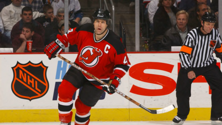
New Jersey Devils fans wanted a third jersey and they got it. Although influenced by Martin Brodeur fans weren’t thrilled with the new design.
Now that logo is gone and replaced with the wordmark of “Jersey” across the chest. Nowhere to be found is the famous logo except on the hockey pants. The famous red is only an accent on the numbers and “Jersey” wordmark. White lines are everywhere.
The Devils released a statement explaining what guided the redesign. Apparently former goaltender and franchise legend Martin Brodeur had a heavy hand in its creation. The “Jersey” wordmark is in reference to the fact that many people inside and outside the region refer to the state only as “Jersey”. As a lifelong resident of the state, that is 100% correct. Added was jersey lacing around the collar. This is a feature you see on most “vintage” looking jerseys that the Devils had lacked but looks nice to finally make an appearance.
The “Jersey” reference to the area is understandable. After all, the Montreal Canadiens do have that little ‘h” hidden in their logo to stand for “habitants”. It’s not like they put Tony Soprano or Bruce Springsteen on it.
Furthermore, in their press release, the Devils say the Jersey “is inspired by a history of hockey in the Garden State that fans may not be familiar with”. A quick rundown of New Jersey hockey history prior to the Devils, the state was home to the Jersey Devils of the Eastern Hockey League from 1964-1973 and then the New Jersey Knights of the World Hockey Association From 1973-1974. New Jersey is also home to the famous Princeton University hockey team, as well as a myriad of other minor league teams with less lasting legacies.
On this jersey, we see almost no reference to these teams. The “Jersey Devils” had their own red logo the Devils could have incorporated, but didn’t. As for Princeton hockey, perhaps the excessive stripes on the arms are a nod to the Hobey Baker era throwbacks? Apparently, there are 21 stripes, one for each county in New Jersey.
Thanks to the power of Twitter these jerseys were leaked a few days before. Immediate fan reaction wasn’t exactly positive. I took one look and threw my Taylor Ham, Egg, and Cheese down in frustration. I was so sad I had to go to the gas station and have the attendant fill it up with $20 regular cash to clear my head (these are all jersey references if you haven’t guessed). Some fans said the new “Jersey” wordmark looks like the “Jersey Mikes” sandwich logo. Others were quick to point out the similarity to the Chicago Blackhawks 2019 Winter Classic jerseys. When Devils fans said they wanted a third, black jersey, this is what they had in mind.
Franchise legend Marty Brodeur is high on these jerseys. He went as far as to say he wish he played in them. Team alumni also contributed to the new design, which is good to hear. Whether they like it or not, we’re sure a lot of fans will find this new Jersey (pun absolutely intended) under their tree Christmas morning.
