NHL Reverse Retro Ideas for 2022-23: Central Divison

GLENDALE, ARIZONA - MARCH 06: Lawson Crouse #67 of the Arizona Coyotes celebrates with teammates on the bench after scoring a goal against the Minnesota Wild during the second period of the NHL game at Gila River Arena on March 06, 2021 in Glendale, Arizona. (Photo by Christian Petersen/Getty Images)
5 of 5
Next

Before the start of last season, Adidas and the NHL came up with a brilliant idea for alternate uniforms.

The jersey program was simple. Allow each of the 31 teams to come up with creative designs that feature a mix of current and past uniforms that sums up a large portion of a franchise’s history.

Each team has had their own history with uniforms from logos to colors to striping and patterns. The potential was off the charts. When the jerseys were revealed to the public, the league’s idea had come to fruition in a positive manner, as many team’s uniforms were very appealing to fans.

While some of the uniforms were grand-slams, others were disappointing (I’m looking at you Detroit). The results were such a success that the NHL announced that the Reverse Retro program would be reinstated for the 2022-23.

With that information given out, let us dive deep into a unique idea for all eight teams in the Central Division. The eight teams in the Pacific and Atlantic Division are already done, so now let’s get started with part 3.

Ed Jovanovski #55, Phoenix Coyotes (Photo by Christian Petersen/Getty Images)
Ed Jovanovski #55, Phoenix Coyotes (Photo by Christian Petersen/Getty Images) /

Arizona Coyotes- Tan or brick red-colored version of full-body coyote alternate

In 2021, The Coyotes returned to the first alternate design in franchise history. The “Desertscape” designed made a glorious comeback but sported purple as the main color instead of green in the original. For the latest wave of Reverse Retro, the team in the desert should bring back the last alternate they wore.

These full-body coyote uniforms were released for the 2008-2009 season and lasted until the 2013-14 season. When the franchise changed it’s moniker from Phoenix to the Arizona Coyotes for the 2014-15 season, these were scrapped. Since then they have never been seen again.

This is another uniform that has been criticized a lot over the years for being “ugly”. However, I don’t see anything wrong with the design at all.  I’ve personally always enjoyed the look and the full-body portrait was something that really hasn’t been seen too much for teams with animal names.

Considering the fact that there really aren’t many other options to go with besides this jersey made the decision easier. It would be nice to see this make a comeback after being dormant for almost a decade.

Arizona has never worn a jersey that is primarily tan, so this could be an opportunity to jump on that. Also switching to the brick red as the primary color also would be a good choice in mixing this design up.

It wouldn’t surprise me at all if they were to also bring back this design using some of the colors on the original Kachina logo. Similar to how they chose the purple from that logo and make it the primary color on the 2021 Reverse Retro alternate.

Another cool choice that could happen is to use the Arizona State Sun Devils colors of maroon and gold since they will be moving into their hockey arena for the next few years, for better or for worse. However, I would still like to see this design make a return with a basic color swap of black to either tan or brick red.

Jonathan Toews #19, Chicago Blackhawks (Photo by Gregory Shamus/Getty Images)
Jonathan Toews #19, Chicago Blackhawks (Photo by Gregory Shamus/Getty Images) /

Chicago Blackhawks- White version of 1920’s and 1930’s black uniform

During the 2021 Reverse Retro program, the Chicago Blackhawks came out with a modernized replica with the jersey they wore in 1940. It was the only jersey in the 2021 series that used a design the predated the Original Six era.

I believe that they should go down that route again. Historically, Chicago’s uniforms haven’t been all that appealing to me, but then again, I say the same for all of the Original Six teams. Although that’s the case, I’ve always loved the black incarnations they’ve brought out. That includes their 2019 Winter Classic jersey.

The 2019 Winter Classic jersey for the Blackhawks are actually modern re-releases from the black uniforms they wore from 1927-28 to 1933-34. I became a fan of these ever since I first saw the reveal before the 2019 Winter Classic and there is a good reason to be a fan of them. It’s a good, clean look that gives non-Chicago fans a somewhat breath of fresh air from the typical red they always sport.

However, even though I love the black version of these, I would really like to see the franchise do a basic color swap, making the jersey primarily white. There is a good chance we won’t see too many white Reverse Retro jerseys next year, as we saw in 2021, so this would be a perfect candidate to come out with one.

I know that if they were to come out with this design in white, it would be a day one buy for me. It would also be the first time that Chicago would wear a white alternate jersey for an entire season in team history. That obviously excludes the Stadium Series 2016 look and the 2015 and 2017 Winter Classic editions.

Joe Sakic #19, Colorado Avalanche Mandatory Credit: Robert Laberge /Allsport
Joe Sakic #19, Colorado Avalanche Mandatory Credit: Robert Laberge /Allsport /

Colorado Avalanche- Original 90’s jersey with Quebec Nordiques twist

The Colorado Avalanche hit it out the park a few years ago with their Reverse Retro uniform. They went back to their roots as the Quebec Nordiques for the first time in 2021. They wore Quebec’s uniform but Colorado inserted their own color scheme of burgundy and blue on a primarily white background.

It was a beautiful sight and it was amazing to actually see them don the looks of a franchise that no longer exists but that still left a huge mark in NHL history. By far it was one of the more popular Reverse Retro jerseys and an argument could be made that it was the best amongst the 31 teams.

Now it’s time for Colorado to go back to one of their own jersey designs this time around. The Avs jersey history isn’t quite that extensive. They have worn a few alternates throughout the years but if we’re talking on what would be the best choice to go with, than they should reinstate their original jerseys(or is it their current one?) with the mountain striping.

It’s the look that the Avalanche are most known for. It’s a great jersey nonetheless. In my opinion they should just stick with this. However, in the same way they took a Nordiques jersey and swapped it out with their colors, they should take their own jersey and swap out the burgundy and blue for the distinct shades of red and blue that Quebec wore. I also think it would be cool if the Avalanche can also swap out their logo and replace it with the Nordiques one but I don’t think that would go too well with the fan base. A color swap would be great though.

Neal Broten #7, Dallas Stars Mandatory Credit: Rick Stewart/ALLSPORT
Neal Broten #7, Dallas Stars Mandatory Credit: Rick Stewart/ALLSPORT /

Dallas Stars- 1990’s jersey with a homage to tenure in Minnesota

For 2021, the franchise in the Lone Star State came out with a great Reverse Retro jersey in my opinion. They brought back their design from the 1999 Stanley Cup championship team. An already great jersey, Dallas made it look sharper in my opinion by making it all white. Since many teams didn’t go with white jerseys the first time around, it was pleasant for me to see them do it.

The Stars don’t have many different designs to pick from throughout the teams’ history and that is including the 26 season stint in Minnesota. So it can be like pulling teeth to try and pick a different design that isn’t boring for the masses. for next season’s Reverse Retro line.

However, it’s not impossible and the Stars have worn some jerseys that have been pretty good. This leads us to the design that will be talked about here. For this time around, I would like to see the Stars use their jersey design from 1991-1999. These jersey’s were actually debuted during the last breath of the Stars stay in Minnesota.

These came out in 1991 and lasted for the final two seasons the Stars played in the Land of 10,000 Lakes. After the 1992-93 season the Stars moved to Dallas, Texas where they would continue to rock these designs until the end of the 20th century. The only major differences that this design saw over it’s span was a shoulder patch of Texas being added and the spacing between the stripes.

I’m completely fine with this design making a comeback for next year. To me it would be nice if the Stars can invert the black and dark green color combination to the light green and yellow combination for this uniform. Obviously the light green and yellow would pay an homage to the Minnesota North Stars color combination. It would look pretty sweet and it would be the first time Dallas would acknowledge their time in Minnesota since the move took place in 1993

Lubomir Sekeras #77, Minnesota Wild Mandatory Credit: Rick Stewart /Allsport
Lubomir Sekeras #77, Minnesota Wild Mandatory Credit: Rick Stewart /Allsport /

Minnesota Wild- Red Version of Original Home Jersey

So… it’s time to talk about Minnesota’s second NHL team, the Wild. The Wild have only been around since 2000. So that mean’s they don’t have an array of options to pick from. They did a fantastic job with last year’s Reverse Retro. They patterned their jersey design after the 1978-79 Minnesota North Stars.

They recolored the Wild logo into the North Stars color scheme of light green and yellow. It was a nice looking uniform and it earned tons of more appreciation points from me because of the fact that the Wild were throwing it back to another franchise that has no relation to the Wild. It’s also important to note that the state still had hard feelings about the North Stars leaving when the Wild debuted. So it was nice to see them don the colors of the old team that left for that reasons well.

Since I chose the Stars to bring out the old Minnesota North Stars style, the Wild would have to settle for something else. Besides they already did that last year as stated, so I doubt they would want to rehash the same idea again. This leads us to strictly pick from only what the Wild have done from aesthetically.

Like stated before, the Wild have only been around since 2000. Because of that they have only a few distinct jersey designs to go back too. So, I’ve just settled on their original jersey design they used from 2000-07. The ones after that feel too new for me to go with for the Reverse Retro jersey line.

This is a good look for the Wild to return with. It’s clean and sharp. There is nothing ugly about it whatsoever. Everything contrasts well with each other. There is nothing wrong with this. I would just swap the colors to make this a primarily red jersey. I’ve never been a huge fan of the Wild branding so I’m not a crazy when it comes to what they might do. To me this is their only option. Minnesota has worn red jerseys in the past as well which proves that a simple color sawp would work. Moving on.

Ryan Suter #20, Nashville Predators (Photo by Frederick Breedon/Getty Images)
Ryan Suter #20, Nashville Predators (Photo by Frederick Breedon/Getty Images) /

Nashville Predators- Gold or Gray version of 2009-11 Alternate Jersey

Last year, Nashville came out with a gold version of their original home uniform. They wore it from 1998-2007. After they brought back their original uniform, the Predators were left with only 2 legitimate options for this year. They could bring back their hideous mustard yellow alternate jersey. Or they could return with these alternate jerseys they wore for two seasons between 2009 and 2011.

Other than those two options I pointed out, they rest of Nashville’s jersey catalog doesn’t really offer much else. The other uniforms that they have worn are way too new to qualify for the Reverse Retro line. I don’t think people would really want to see the mustards’ make a return, including myself, so we’ll have to pick these to make a comeback.

Obviously, this isn’t a super appealing jersey. The navy blue and white combination is fine and the crest really pops out, however I’m sure people weren’t clamoring to get this uniform when it debuted. It just feels a little lifeless to me and I’m sure to many others. To compensate, I would make this uniform primarily gold.

I know many people aren’t fans of yellow being the main color on a uniform and believe me I’m not a huge fan of it. However, the Predators have made it work before, and they are even doing it now with their basic home jersey. They’ve worn yellow every year since 2011. But then someone might bring up that they should go with another color since they currently wear gold as stated.

So I could see them making this primarily gray as well. The Predators have never worn a gray uniform before, so this could an opportunity to add something new and unique to their jersey history. Nashville has incorporated elements of gray or silver into some of their unforms in the past. If the choose to go gray then they could make the stripes navy blue. In between the stripes, they could potentially throw in some gold as well.

If I was in charge of choosing I would go primarily gray, just because of the fact that the Predators have never worn a gray jersey before. And like stated already, I don’t think it would make sense for them to don a gold version of this unform since they already wear gold on their home jersey. However, I think that either option would be a great choice when bringing this jersey back. It’s basic overall design works well with any color.

Vladimir Tarasenko #91, St.Louis Blues (Photo by Dilip Vishwanat/ Getty Images)
Vladimir Tarasenko #91, St.Louis Blues (Photo by Dilip Vishwanat/ Getty Images) /

St. Louis Blues- Yellow Version of Original Uniform

Now it’s time to go back to a franchise that has been around for a long time. The St. Louis Blues, part of the famous expansion class of 1967, have work so many unique and different jersey designs. Throughout their 55 season history, the Blues have gone from simple to extravagant and back to simple several times over with their jersey designs.

For 2021, St. Louis came out with a red version of their 1995-98 jersey design. That result was a success. I’m sure there were some people, mainly diehard Blues, that weren’t amazed by the decision to come out with a red jersey. However, I personally loved it. Being that red was never a main color for the Blues at all made that Reverse Retro even more impressive.

To me it is great when certain teams dive out of their comfort zone and do something completely different. In some cases, the creativity fails miserably but there are times where it succeeds. The Blues uniform was an example of that. And now, they get a chance to do something to that degree again.

Over the course of their long existence St. Louis’ main color scheme obviously consisted of some shade of blue, either light or dark, yellow, and white. St. Louis has never worn a yellow alternate before. Since the Reverse Retro line is supposed to offer classic designs with simple twists, we’ll take advantage of that for the Blues. For the first time ever, the Blues will wear a primarily yellow jersey.

Out of all the Reverse Retro ideas, on these lists, this is the idea I would love to see the most. As for the specific design I want to see them use, it would be a no brainer to want to see them bring back the original design once more. I know they’ve had plenty of other designs, but this is the best one for many people, including myself. Just simply swapping the positions of the blue and yellow on this jersey would be a breath of fresh air.

It would still look sharp and clean but it will be something new. For this franchise, something new is needed. A yellow St. Louis Blues jersey in some way shape or form would be awesome. I’d personally be in line on release day to pick one up for sure. St. Louis, please make this happen? Nothing much else to say. Let’s move onto the last team in the Central Division, the Winnipeg Jets.

Keith Tkachuk #7, Winnipeg Jets (Photo by Mitchell Layton/Getty Images)
Keith Tkachuk #7, Winnipeg Jets (Photo by Mitchell Layton/Getty Images) /

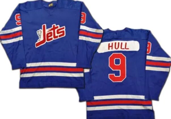
Winnipeg Jets- Red Version of 1990-96 Jersey

When discussing both incarnations of the Winnipeg Jets and their jersey history, there is surprisingly not much to choose from. In 2021, they once again did an altering on their 1979-80 uniform, in which they brought over from their WHA days. They used their current color palate with no red, and used a dark gray base. It looked pretty sharp but it certainly wasn’t in my favorites list. I don’t know if Jets fans were thrilled about the jersey.

Their might have been some difference on opinion. I’ll tell you one thing though. They could have done a bit better. The 2021 Reverse Retro was the third time since 2016 in which they brought back some resemblance of the WHA era uniforms. They came out with darkened replicas of the white version of it back for the 2016 Heritage Classic. Then for the 2019 Heritage Classic, Winnipeg wore navy blue versions of said uniforms. Not to mention they are currently using those exact models as their main alternate jersey as well.

I think it would be wise to bring back a different era of Jets uniforms for the first time. The franchise has two options to go with. They can either use their original WHA uniforms they wore for just the 1972-73 season. Or they can go with the jerseys they wore from 1990 all they way until 1996, when this incarnation moved to Phoenix.

I think these would be awesome to go back. The reason is because ever since the second incarnation of the franchise came from Atlanta, these jerseys never eyed a comeback in any form. Out of all the Jets jerseys that have been worn throughout the years, this one is by far my favorite.  I think that the franchise going back to this design would be a great idea. Knowing that this is the same uniform that legend Teemu Selänne also broke out in, makes me want to see this brought back even more.

As far as coloring goes, the Jets can do the same thing that they did when they brought back the WHA uniforms. That would be recoloring the red and blue into darker shades, to fit their current color scheme that they sport today. That would be fine and I’m sure diehard Winnipeg supporters would enjoy that. However, I want to see the Jets wear primarily red for the first time. Same thing with St. Louis, a jersey that is mainly a color that a team has never worn before would offer a breath of fresh air and something new fans can experience. The Jets have never worn a red jersey at all and I think a simple color swap would be an amazing look.

Next. Reverse Retro Jersey Ideas for 2022-23: Atlantic Division. dark

Next