

")

Pittsburgh Penguins- Robo Pen Jersey with Original Baby Blue Color Scheme
The Pittsburgh Penguins have a large collection of different jersey designs, logos, and colors throughout their entire five-decade history. When it comes to style, the Penguins are definitely at the top of the list. They have come out with some of the most memorable uniforms in NHL history and they have plenty of choices to choose from for this year’s Reverse Retro line.
In 2021, Pittsburgh brought back the diagonal road uniform that they wore from 1992-97. However, instead of the jersey being black, like in the original version, the Pens made it all white. I enjoyed it quite a bit. I think it was one of the better Reverse Retro jerseys of 2021. What I really wanted to see though was the return of the Robo Pen era from 1992-02.
This specific era in Penguins’ history is my personal favorite when it comes to the uniforms. I love the logo. This is the perfect opportunity for the franchise to throw it back to the phenomenal days of Jaromir Jagr fully cementing his status as a superstar. There were definitely some great moments during the time the Penguins donned the Robo Pen jerseys, especially in 1995-96, when Jagr created the famous “Sky Line” himself, playing with Mario Lemieux and Ron Francis.
The Penguins have never gone back to this era in any particular way. I think it’s time the Robo Pen makes a triumphant return this upcoming season through the Reverse Retro line. I wouldn’t mind if they used the white home jersey but I would really like to see them use the gradient fade-away jersey pictured above. With this design, it would be cool to also see the Pens incorporate the original baby blue color scheme when the franchise first began in 1967. Using a baby blue base with accents of navy blue and white would look really sharp. I think the gradient fade in the middle should go from navy to white. The logo would probably be baby blue on the left portion. The middle would stay white and the right portion/head would be navy blue.
/cdn.vox-cdn.com/uploads/chorus_asset/file/19547830/125949796.jpg.jpg)

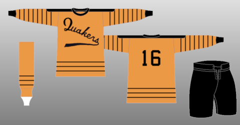
Philadelphia Flyers- Throwback to early 1930’s Quakers days
Unlike their in-state rivals, the Philadelphia Flyers haven’t had a huge collection of different logos and jersey designs. Ever since their inception in 1967, the Flyers have had only one logo and mainly one uniform design. There have been some minor changes to the uniform over the years but primarily it has stayed largely the same. It wasn’t even until 1997 that the franchise finally came out with an alternate, which was primarily black.
In 2021, the Flyers did an okay job when it came to their Reverse Retro alternate. Philly brought back their orange jerseys, specifically the version from 1982-2007, and swapped the black and orange elements out for one another. It looked pretty good. But this jersey program is supposed to bring out new creations and be different. The Flyers 2021 retro didn’t feel different at all. It wasn’t a breath of fresh air to me and it didn’t feel new.
This wasn’t entirely the fault of the people who were coming up with the design. As said earlier, the Flyers don’t have much to work with, so their hands were tied behind their backs. But it’s always nice to have a second chance and I’m going to do my best to compensate for that. In order to do so, we need to go back all the way to 1930 when there was an entirely different franchise in Philly that no longer exists today.
Ladies and gentlemen, It’s time to talk about the short-lived Philadelphia Quakers. As a quick history lesson, the Philadelphia Quakers came into the league during the 1930-31 season. They were a relocated franchise. Ironically, the Quakers were previously known as the Pittsburgh Pirates(don’t get confused with baseball). The Pirates called the Steel City home from 1925-30. Then they moved to Philly. In the 1930-31 campaign, the Quakers were by far the worst team, going 4-36-4. After the terrible year, the franchise then suspended operations for a few years and eventually folded on May 7, 1936, because of The Great Depression.
Now with that out of the way, I know people might question why my idea for the Flyers involves a defunct terrible franchise that posted a historically bad record. There are a few reasons why I went this route. As stated earlier, the Flyers don’t have much to work with. So because of that, we have to think outside of the box. Secondly, Philadelphia has morphed into a city where hockey is arguably the main attraction as far as sports are concerned. Because of that, I believe it would be wise to go back to the city’s pro hockey roots and show admiration to really the beginning of hockey being a player in the pro sports landscape.
Thirdly, I kind of like the uniforms. I’m okay with the design of it. For a jersey from 1930, it doesn’t look all that bland. I like the script font logo on the front as it’s something that really hasn’t been replicated at all for a wordmark logo. It’s unique from that aspect. I like the simple striping on the bottom as well. I think mixing in some elements of a Flyers jersey with some elements of the particular Quakers jersey would work really well. I would add some white in between the stripes at the bottom. I would get rid of the stripes on the sleeves as I think it’s too much. Of course, names on the back would need to be added. The shade of orange can either stay the same or change into the specific shade of orange the Flyers use now. And as far as the front crest is concerned, I would recommend switching it to the Flyers logo. The Quaker’s wordmark is a little bland for today’s standards, even though I like it. I think an inspired jersey from the Quakers would be widely accepted by tons of fans and I think it has the potential to look really good.