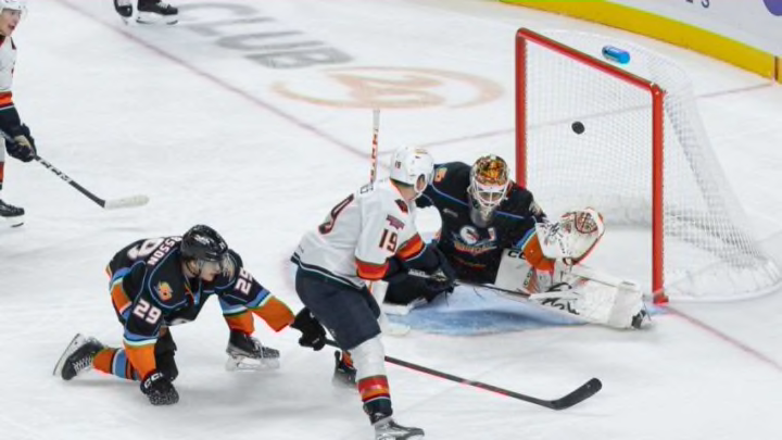
The San Diego Gulls will turn back the clock this weekend to the 1970s. The Gulls, the AHL affiliate of the Anaheim Ducks, will hold a special Disco Night promotion this upcoming Saturday against the Ontario Reign. Just like every other great minor league hockey promotion, this one comes with its own special jerseys for the occasion.
The first thing that strikes me is the color scheme. The Gulls’ main colors are light blue, black, and orange, yet this jersey is a red and purple hybrid. There was a version of the Gulls that existed from 1966-1974, and we thought maybe they used this color scheme, but their colors were much like the current Gulls, except with more white instead of black.
“Stay Classy, San Diego” is what Will Ferrell always said in the movie “Anchorman”. Are the San Diego Gulls 1970’s inspired jerseys a tribute to him?
Orange can be found on this jersey’s collar. The regular and current Gulls home uniform features accents of blue and orange stripes on the collar. That all-familiar baby blue is nowhere to be found in this not so blast from the past.
Here's a closer look at our absolutely bomb Disco Night jerseys!
— San Diego Gulls (@SDGullsAHL) January 23, 2023
Can't wait to wear these on Saturday 🕺
The logo does have a very 1970s flair to it. It doesn’t match the logo of the 1970’s era Gulls but of a more generic 1970’s era font and typeface. It actually looks pretty similar to the logo and wordmark the San Diego Padres used from 1978-1984. The yellow on these Gulls jersey is closer to the yellow the Padres used during that time period instead of the dark “bird beak” orange the Gulls” use today.
Below the logo is a few multicolored stripes of vibrant colors taking the place where the thin orange and white strips are found on the current San Diego uniforms. One of those colors is the typical “bird beak” orange, followed by yellow, red and magenta. These stripes are not straight, but are wavier, almost like a groovy rainbow. The strips feel a little more “hippie 1960s” instead of 1970s disco. There are disco ball shoulder patches. When you don’t see them up close, they, unfortunately, look like blank white shoulder patches.
We were half expecting an “Anchorman” reference with these jerseys. The popular Will Ferrell comedy does take place during the 1970s in San Diego. While using the movie’s logo and characters would have required some legal hopes and permission, the Gulls could have had some sort of reference. For the record, the Padres do embrace the San Diego roots of “Anchorman” with an in-game mascot race. Maybe having the log in the same font as the channel four logos in the film? Maybe using the color of the main character’s iconic suit?
That’s when it hit me: maybe the red, burgundy color of the jerseys is a nod to the dark red suit will Ferrell’s character wore in the movie? The color is almost identical (there’s a picture in this article for reference). If that’s what the jersey designer’s intentions were it almost went directly over our heads.
As much as I love the idea of a disco night, I can’t say I love these jerseys. The Gulls have history during that time period but instead they went with a totally uninspired design when they could have gone with something a bit more unique to the region and the franchise. We want to believe the red color of these jerseys is an “Anchorman” reference just so that it would make sense. After all, why would a team with black, baby blue and dark orange choose that shade of red?
