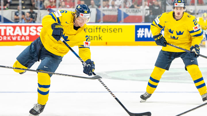
Aesthetically, the 4 Nations Face-Off is going to look very, very good. And in case you missed it, the NHL unleashed all four uniforms earlier this week. I’d have concocted a uniform ranking earlier, but it was impossible to decide which teams resided at No. 1 and who stuck around at No. 4.
At least it was the case in the short term. After going back to the drawing board a few times, and using the process of elimination in what I see in a truly good NHL uniform, I’ve finally drawn some conclusions.
Yeah, this one’s a subjective list, I won’t lie, especially since it seemed like the NHL leaned heavily on tradition (thank goodness) and less on the ‘storytelling’ that makes no sense and runs rampant in the other leagues. Not that there isn’t some ‘storytelling’ there, it’s just not front and center.
4 - Finland
Team Finland may not have the best team in the 4 Nations, and you can say the same about their uniform. While I liked the white base, the royal blue, the flower, and the (also thank goodness) fact they went with ‘Suomi’ on the crest as opposed to ‘Finland,’ speaks volumes.
But the knock here is the way they tried to clash the royal and navy blue onto the typeface. It looks like gradient done badly, and there’s a good chance Suomi would’ve skyrocketed to the top of this list had they just rolled with one color, preferably the lighter shade as it bodes better with their magnificent flag.
3 - Canada
It pained me to put Canada so low on the list, since the striping and maple leaf insignia scream tradition. And while we’ve often traditionally seen black on Team Canada’s uniforms, it’s that one subtle detail that’s also traditionally (yeah, I’m repeating myself a lot) been an eyesore.
If the maple leaf had simply a white outline as opposed to black and white, this uniform would’ve cooked. Ditto for the back and sleeve numbers. Thankfully, I didn’t see a black outline on the horizontal stripe running across the jersey.
2 - USA
Team USA might boast the most aesthetically pleasing look, given its red and white striping near the elbows and at the waist. But why roll with navy blue when a lighter shade would’ve looked so, so much better?
If the US made just that one minor adjustment, I’d have put them at No. 1 and wouldn’t have thought twice about it. Overall, it’s a solid jersey, but royal has always superseded navy.
1 - Sweden
Another team that would’ve looked better with a lighter shade of blue. But you can’t judge down too much when there are two things I love about this one: The triple crown insignia, and the fact that Team Sweden didn’t have to put their team name on the front.
Bonus points for refusing the need to use any differently-colored outlines at the name or number, and how the timeless Nordic Cross on the Swedish flag is embedded into the striping. Again, this is storytelling without the need to explain it.
