NHL Jerseys: How To Change All 31 Jerseys

After writing pieces about the NHL Expansion Draft and The Strengths and Weaknesses of Playoff Teams, I’m going to be the Fashion Police. Let’s judge all 31 NHL Jerseys.
Hey, nobodies’ perfect. There are problems everywhere you look, including in the NHL. Recently, Adidas (the new NHL athletic wear manufacturer) announced there will be changes to 13 NHL teams’ jerseys. Which means we’re talking about the NHL Jerseys that fans and players were to separate themselves from other fanbases and teams. Cause when you play with Phil Kessel, you need to be reminded of that fact.
This is going to be a fun article. Cause guess what? I have many, many opinions on this subject. All of them are likely wrong, but so what? I want pink NHL Jerseys. There should be nothing wrong with that. Let’s start with the perfect NHL Jerseys:
Chicago Blackhawks

Maybe (a very small maybe) a logo change is in order, but other than that, moving on! (And yes, it would be this logo done by artist Mike Ivall.)
The 13 Teams Getting Changes
Those 13 teams mentioned by Adidas? They are the Boston Bruins, Buffalo Sabres, Calgary Flames, Colorado Avalanche, Columbus Blue Jackets, Dallas Stars, Edmonton Oilers, Florida Panthers, Minnesota Wild, Nashville Predators, New Jersey Devils, and Ottawa Senators. And, of course, there’s the creation of the Vegas Golden Knights jerseys.
Boston Bruins

The Bruins have a signature look that shouldn’t be messed with, except from one thing. This is an Original 6 team, their logo is a classic, and their colors are great. A little too close to Pittsburgh, but it’s the other way around, as Boston came first.
The one change I would make: close up that neck. The strings don’t work for every jersey, in my own opinion. In fact, there’s very few who pull it off. The teams who do, by the way: the Columbus alternates, Montreal Canadiens, and San Jose Sharks.
The away jerseys and the alternates have closed necks for Boston. It’s a small change, but it’s better looking. Or, at the very least, change the color. The Black and Gold is what Boston is known for. Be different, and change them to gold and black striped.
Buffalo Sabres

I really like that Buffalo Blue and Yellow. They recently changed it to make it stick out more, and boy does it. I mean, I miss the old Buffaslug logo, but who doesn’t. Again, the first change is to close the neck or make it stand out more by making it that bold yellow.
Then, get rid of the number on the breast. The only things that should go there are the C/A or the Playoff patch. It’s cleaner that way. Then declutter the arm, one or two stripes instead of the three.
Then thicken the white lines. I like the slimming effect it has, and that should be shown off more. Lastly, make those gloves one solid color.
Calgary Flames

Again, this is a matter of cleaning it up a little bit. Making the bottom all red, and then thickening those gold stripes at the very bottom. Show that tertiary color off more, and let the black at the top and in the logo speak for itself. I would make the shorts a deeper shade of black, as it appears blue. I would keep those vertical gold stripes on the shorts, though.
Colorado Avalanche

The Colorado jersey is one of the best uses of the color blue out of all NHL Jerseys. Now, having said that, I want more. That’s a gorgeous shade, and Colorado should utilize it more. You know how? Blue Shorts! Black’s the fourth color in these jerseys, and that’s too many for NHL Jerseys. Instead, making them those deep blue makes it more Colorado Avalanche-y.
I’m actually fine with the vertical blue stripes on this jersey. I would move the secondary logo a little bit further up the shoulder though.
Columbus Blue Jackets

I really like these jerseys. But there’s one thing. Their alternates are better. But currently, there’s no such thing as a Columbus Blue Jackets jersey. Thinking about it, I might switch the color schemes on the alternates to the Blue Jackets’ main one. Or switch the logos and keep going with the primaries.
Maybe even go with the alternates as the away jersey, and make the deep blue in the alternate the color white (as per usual with NHL Jerseys).
I’d also make the white stripe that’s barely visible down on the bottom thicker and the same with the red stripe that appears to top it.
Dallas Stars

I’m a big fan of that logo on the shorts. Except there should be no logos on the shorts. Put that on the shoulder, and clean up the shorts.
Get rid of the neck strings. There’s no good secondary color in Dallas to change them to, so changing it to a closed neck is the best idea. There’s nothing wrong with the Stars not having a secondary color. There just isn’t a secondary color.
I would switch the black stripes to yellow to update Dallas’s look to be closer to the whole “stars” thing. A nice pallid yellow, so that it doesn’t clash too much with their green, but a duller yellow makes the green pop more than the black currently does.
I guess there is something wrong with them not having a secondary color.
Edmonton Oilers

One of the confirmed details of the Adidas change is that Edmonton is getting rid of their old blue home and rolling with the orange they wore in the playoffs. I don’t mind that at all.
In fact, show off more of that orange by putting an orange stripe in the middle of that blue on the bottom. I like the vertical orange on the shorts, and want more of it.
Again, I would make the gloves one color, and that being the blue. Also cleaning up the breast area from any non-essential patches would be a smart idea. The Oilers have already caught on to the whole colored numbers thing, so that’s not a problem.
I would also switch the neck stripe to the deep shade of blue. I don’t like the color black with this jersey. Showing off their beautiful colors is one of the reasons Edmonton is switching.
Florida Panthers

Now, Florida has just recently changed their jerseys after changing their logo. Still, there are problems with those jerseys. First, nothing at the bottom? That look has become a signature to the NHL, but I don’t mind a little variety. Still, I would add some gold stripes down there, show off the tertiary color a little bit more.
I would also change the color of the shoulder numbers to blue, cause the white is featured prominently enough in that bold stripe across the stomach.
Minnesota Wild
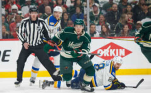
I’m really digging the whole color scheme of Minnesota and the simplicity of these jerseys. Because the neck opening is different than other NHL Jerseys, I don’t even mind the strings. They’re tight and controlled and aren’t just dangling there. They look like how you’re supposed to tie Converse.
I would throw the primary logo from the shorts onto the shoulder, where there’s room. I would also add a little bit more of the red, maybe the bigger of the bottom stripes and the stripes on the arm. And then I would make the other stripe match more closely to the color on the sock. That cream color matches well with the forest green.
Nashville Predators

Again, the Nashville Predators are another example of one of the best uses of color in all NHL Jerseys. This time, they utilize yellow to the fullest extent of its range. There’s a lot going on with Predators jerseys.
First, on the numbers in the back, there’s guitar strings in the middle of the number. I would add that little detail to the numbers on the shoulders. A little continuity never hurt anybody. I would also bump everything on the arms a littler further up.
I would also bump the piano keys detail on the inner collar to the outer collar, and make the black keys the Predators’ signature black/blue. With the full yellow theme going on with the Predators jerseys, I would make the gloves all yellow to match with the helmets.
New Jersey Devils
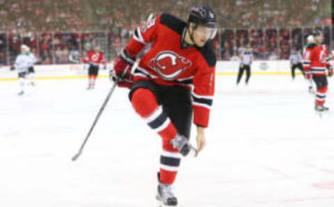
The New Jersey Devils need to introduce green as a tertiary color. The color Puddy famously wore with the red and black. I think it would give the Devils that 90’s look, and considering their success in that decade, it’s not a bad thing. Substitute it for the white stripes in the above picture.
If anybody can pull off the Christmas look, it’s the Jersey Devils, who were just gifted, Nolan Patrick. Also adding in a secondary logo on the (currently) empty shoulders would be a bold new move.
Apart from that, there’s no need for changes in the Devils jerseys. I actually like the two-color gloves in this jersey.
Ottawa Senators

First of all, the first change Adidas will make will be to remove the 25th patch from the chest. Secondly, let’s get to the other changes that should be made, including the addition of gold to this jersey.
It’s a color that features prominently into their logo, but the Senators currently don’t utilize it. There are tons of teams that are red and black right now. None of the NHL Jerseys are red and gold featuring hints of black though. Plus, looking at the center of their jersey, it’s a combination that works.
Again, clean up the shorts as well. Bump the “O” logo up to the shoulder proper, and bumping the number up the sleeve. I also like the idea, now that technology has made this possible, of the Ottawa Senators utilizing their gold in their skates. Show those off.
Vegas Golden Knights

Alright, a reminder that this is their logo. And this is their alternate logo. So, because the Vegas Golden Knights currently don’t have a jersey, and because they don’t have a roster, let’s create our own.
We’ll want to feature red as the tertiary color, as the Golden Knights utilize that blue/gray in their primary logo. It’s not a great color, but it’s what they’re going with. I want them to utilize gold as their primary color, as there is currently no NHL Jerseys doing so. Yes, the Predators are yellow, but that’s a different color than Golden Knights Gold.
So Mainly gold, with the Devils/Bruins shoulder rounded look in that blue/gray. The alternate logo on those shoulders. The numbers up high on the shoulder, done in red, outlined in gold. Then the blue/gray and red stripes down on the bottom, a red one, thin, in the middle of a thick blue/gray.
Do the shorts in that blue/gray. Then the socks are white with gold and red stripes. The gloves are solid gold. Skates are black. On the sleeves is three stripes: One thick blue/gray, one thick red, one thin black. It’s black in the middle of red in the middle of blue/gray.
Numbers on the back done in red.
The Other 17
So that leaves us with the Anaheim Ducks, Arizona Coyotes, Carolina Hurricanes, Detroit Red Wings, LA Kings, Montreal Canadiens, New York Islanders, New York Rangers, Philadelphia Flyers, Pittsburgh Penguins, St. Louis Blues, San Jose Sharks, Tampa Bay Lightning, Toronto Maple Leafs, Vancouver Canucks, Washington Capitals, and Winnipeg Jets.
Because of the rich tradition of these teams, a lot of this will sound like blasphemy. Please, stick around. Minor changes abound.
Anaheim Ducks

All that black is boring. The Ducks webbed D doesn’t work anymore. So let’s spice this jersey up a little bit, eh?
I know their new rivals the Edmonton Oilers are switching to their orange. But you know who wears the orange better? Anaheim. Intensify that rivalry by also switching to the Anaheim alternate jerseys. That orange with the old Duck mask? Now that’s one of the great NHL Jerseys. If they add some black to the top of the shoulders/neck area, that would match more closely with what the Ducks should be rolling with.
They can keep the away jerseys with the webbed D, but switch that neck/shoulder area to orange.
Arizona Coyotes
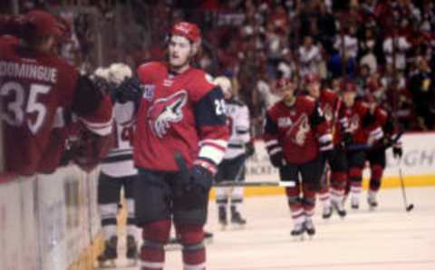
The Coyotes, I’m sorry to tell you Arizona fans, have some of the worst NHL jerseys. How do these jerseys even work? It’s boring to look at. Maybe even more boring that than black Anaheim jersey. But you know what’s not boring? What Arizona used to skate in. Those are some dope jerseys. From the Native design at the bottom to the actual Coyote playing goaltender, those are some throwbacks that should be reverted to.
If the Coyotes are wanting of an update to those 90’s jerseys, here’s some. Go with your new color scheme, of the dried red and the black and white. Switch the black and red in the home jerseys, and put white in the shoulder area. The Coyotes can also use their new logo. But adding some of those 90’s details into their jerseys wouldn’t be a mistake.
Carolina Hurricanes

I don’t like monochromatic NHL Jerseys. That’s one thing the Carolina Hurricanes are very bad at – it’s all red and white. I love that in the away jerseys when there’s less call for color. I don’t like it in the home jerseys displayed above.
Changing the shorts to white is one quick and simple way to add a little color to the all-red current getup. Also changing them to black is a more traditional way of doing that, but I think Carolina going with white would be an interesting and modern take. Also, adding white to the shoulder area would help.
Again, the Hurricanes are a team that must close up that neck. Or, actually, change it to the barred strings instead of the dangling. The white/red combo works if they do that.
Detroit Red Wings
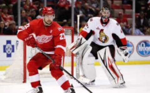
Same thing with Carolina. In fact, Carolina is just a more modern, darker version of the Detroit Red Wings jersey. But substitute the winged wheel logo over the storm’s eye, and you’ve got a good mockup of Detroit, cause Detroit very much came first.
Because of this, I’m not going to recommend the same things for both teams. That means not changing the shorts and there’s no need to close up a closed neck. That leaves me with few options on how to change Detroit’s original 6 looks.
I would change the sides to white, thicken the white stripe on the bottom of the jersey, and add more of the white stripes to the sleeves. There’s a lot of white detailing in the winged wheel. There should be a lot of white detailing on the jersey to match.
LA Kings

Here’s the thing, LA Kings. Lots of teams wear black. You know what no teams currently wear in the NHL? Purple. Like the Kings used to wear. Updating that look would equal some of the best NHL Jerseys. Start with making everything black in the above jerseys purple. White becomes yellow. Yeah, they look a little bit clownish. Which is why it needs updating.
Add more yellow to the base of the jersey. Keep the shorts black. Silver stripes remain silver. Black and white logo stays black and white. Do the C/A and names in white outlined black. Shoulder area becomes silver. Everything else, though, becomes purple and yellow. That’s a modernized Kings look that separates them from the rest of the NHL Jerseys.
Montreal Canadiens

The Montreal Canadiens are one of the oldest and most successful NHL teams. There’s not a ton about the bleu, blanc, et rouge that needs changing. I would throw some blue back onto the shoulders, change the gloves to all blue, and find a new secondary logo though.
Something like the Canadian flag done up in the Canadien colors.
New York Islanders

Secondary logo. That’s the first thing that pops out at me when considering what the Islanders need. Long Island is already represented in the Islanders primary logo. But they need something more simple for their shoulder. They can put the head of the Fisherman up there. That would be an interesting call back to their past.
Or, because the New York Rangers would never do this, they can throw a New York simplistic skyline up there. Or copy that into the bottom lines on the jersey. There’s also the ability to make an apple look like an island. Or they could do the collected New York city islands as an archipelago.
New York Rangers

The Rangers have some of the most classic NHL jerseys. I’m fine without a logo from the Rangers on the chest, as long as the signature shield eventually ends up back on the shoulders. The stripes make sense on the bottom of the jersey. I’m not a big fan of the stripes on the shorts – they should all be clearly blue detailing.
The outlined numbers on the back are great. It gives off a throwback vibe that very few NHL jerseys have. Three colors make sense on the gloves. Clean up the neck area. I would personally switch to red helmets, but blue makes sense.
Philadelphia Flyers

Creamsicle is a good look for the Flyers. Perhaps that’s why they’ve rocked it since the 1970’s. It may also be a factor in the Edmonton Oilers switching and might be why I like the look for Anaheim as well. Orange looks good in the NHL. I want symmetry in NHL Jerseys, so the Flyers need to stick with one shoulder patch on both sides. I would like some orange stripes on the black shorts, some big ones.
Otherwise, there’s not a lot to change about Philly. If anybody could risk orange helmets, it’s Philadelphia, but that’s up to them.
Pittsburgh Penguins

I fell in love with the Stadium Series jerseys from this year the moment I saw them. Everything about them is special, from the triangular letters on the chest, reminiscent of the old Penguins logo. I would clean up the sleeves, but otherwise, it’s a thoroughly modern NHL jersey. I love the minimalism present in them as well, plus the fact they show off the yellow more than the black.
St. Louis Blues
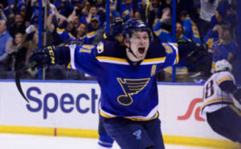
The yellow detailing in the Blues jerseys makes them jump out, and it shows why color detailing in NHL Jerseys is a smart idea. I also like the stripes sprouting from the neck in these jerseys. The gloves are all one color with yellow letters, and that’s a great idea as well. These are good jerseys, all things considered. I would move the numbers to the shoulders. Only change necessary.
San Jose Sharks

The Sharks have a lot going for them in their jerseys. From the symmetry of the sleeves to the socks, from the unique coloring of their jerseys.
The only thing is, instead of numbers or a secondary logo, they have the primary logo on their shoulders. Until they have a secondary logo, I would switch that to the numbers. Unless they want to use the SJ on the shorts as their secondary logo and make that fit more prominent.
Tampa Bay Lightning
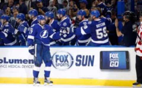
I’m sure you were wondering when I was going to bring the color pink back up. Guess what? It’s right now. The Tampa Bay Lightning should incorporate the color pink into their jerseys. Bold, I know, but they need some way to differentiate themselves from the Toronto Maple Leafs, especially as both teams find success in the coming years.
Use pink as detailing at first, outlining everything white, and see if that works. If it does, add pink streaks to the lightning bolt, and make the circle around it entirely pink. Add a pink stripe in the middle of the white ones on the Jersey. It’s a minor change, but the introduction of a tertiary color to the Lightning’s look would be both fantastic and unique.
Toronto Maple Leafs

The Maple Leafs are an original six team who recently updated their logo and therefore their jerseys. That’s why I suggested Tampa add pink instead of Toronto. They own blue and white, and a tight neck with the bars would make sense on their jersey. I honestly have no idea why any team still has the dangle.
Weird suggestion alert. Because the horizontal stripe works so well on the arm and sock, what about switching the vertical stripe on the shorts to a horizontal one on each of the legs after the divide. Close to the bottom, but it would tie the look together. Cause right now the vertical stripe is detracting and distracting.
Vancouver Canucks

At best, the Vancouver v-stick is a shoulder patch. It should be treated as such, minimized and relocated. Put the proper primary logo back in the middle of the Canucks home jersey permanently. I do like the green in the middle of the jersey though, so the C the orca is breaking out of should be switched in terms of color.
Otherwise, the Canucks have a classic look.
Washington Capitals

First, the shoulder eagle is a great primary logo. It forms a W and is much more of a logo than the word “Capitals” in lower case font. Switch the two. Move the bird to the middle of the chest and have “Capitals” running horizontally up the shoulder. Or shorten it to “Caps”. Make the arm stripes the blue of the belly stripes.
Thicken the blue stripe on the bottom. Make the numbers blue. So many teams use red and white in the National Hockey League. Not many NHL Jerseys are entirely red and blue. I know the Capitals are in the Nation’s Capitol, but the Rangers pull off Red White and Blue the best of any American team.
Winnipeg Jets

I would switch two colors in the Winnipeg Jerseys. Make the lighter blue the primary color, while changing the dark blue/black a secondary color. That powder blue would look really good as a full-on Jersey, while the black looks best in doses.
Next: Sabres Sign KHL All-Star Antipin
Also, use silver and red more often. Those colors are present in the logo but currently not in the uniform, and especially with the light blue as a backdrop, they’d look good.