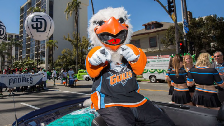
It’s that time of year again. Just before the NHL playoffs start, fans celebrate St. Patrick’s Day. They drink green beer, pretend to be Irish, and watch their favorite teams trot out green warm-up jerseys while “Shipping Up To Boston” by the Dropkick Murphys plays in the distance.
The San Diego Gulls, AHL affiliate of the Anaheim Ducks, are coming up with their own jersey with a little bit of the luck of the Irish.
The Gulls previously wore special 1970s disco-themed uniforms this year, and now, these Blarney Stone-kissed jerseys will make an appearance for San Diego’s March 11th game against the Henderson Silver Knights.
The Gulls had a pretty easy template to use for this one. Their St. Patrick’s Day jersey is nearly identical to the Gulls’ current third jersey. That jersey is reminiscent of the jerseys the former San Diego Gulls team from the Western Hockey League wore during their 1966–1974 tenure.
That makes these jerseys a unique historical throwback as well as festive. The Gulls wore a St. Patrick’s Day jersey during the 2018 season that featured their normal logo, with green accents, against a sham rock-ed backdrop.
The San Diego Gulls revealed their St. Patrick’s Day design for this year.
While the WHL Gulls jersey had a white base, and San Diego’s current third jersey has a light blue base, green is the main color here, as you probably already guessed. The Gulls lettering remains in the “beak orange” color of their normal third jerseys.
That plays very well off the green, as orange is a secondary color usually associated with all things Irish. After all, orange, green, and white are the colors of the Irish flag. The San Diego Gulls logo patch, normally on the jersey’s sleeves, has been replaced by a shamrock patch.
The orange lettering is great. Most teams only go for the green. I found an NHL.com article from 2019 where the Tampa Bay Lightning added a bit of dark gold, and the Pittsburgh Penguins had orange stripes and outlined orange on player numbers and lettering, as well as Irish flag patches.
Those Pittsburgh jerseys had a bit too much going on, and the orange definitely works better with the Gulls. San Diego also noticeably went for a brighter green color than most NHL teams break out.
This jersey is very minimalistic and very clean. There’s still room on the front of the jersey beneath the “Gulls” name to have added something more. Maybe a normal Gulls logo in all green? Maybe the shamrock logo that appears on the sleeves, but featured more centrally?
Because of that, this jersey feels simple yet somewhat unfinished.
The jerseys are currently available for sale on the Gulls website, along with St. Patrick’s Day hats in the same color scheme. It’s nice to see San Diego sell these jerseys to fans.
This jersey is sure to be popular and I wouldn’t be surprised if San Diego breaks the same version out again next year.
