NHL 2019: How to improve every team’s jersey

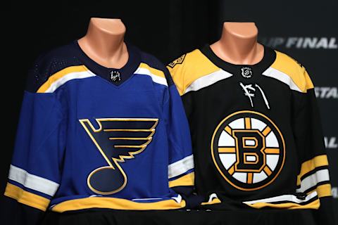
The NHL and their teams love to show off their uniforms and fans love to wear them. Here’s how you get the ideal look for each team.
Back to the topic of NHL uniforms, a topic hockey fans love to think about this time of year. The reason for this is that news is light, and teams often times use this time to reveal their new designs to the public in time for the season to begin.
Now, in the NHL today, we have a mixture of brand new and old-time classic designs, enough to keep us busy with talking about them for a while. Every team has different looks, which makes discussions about the best jerseys even more interesting.
More from Puck Prose
- Detroit Red Wings 2023 Rookie Camp Has Plenty of Ups and Downs
- This Columbus Blue Jackets rookie doesn’t want to be forgotten
- 2 trades the Boston Bruins must make to secure the Stanley Cup
- 3 reasons the Avalanche won’t win the Stanley Cup in 2024
- This is a big year for Alex Turcotte and the Los Angeles Kings
Some teams have a look and brand that hasn’t changed since man discovered fire. Others are still trying to find the right balance between elements. Some others may need a complete overhaul. One team hasn’t even gotten started yet.
The goal of this post is to suggest an idea or two to each NHL team, should they need it, on how to improve their uniforms or logo set to make an ideal aesthetic for today’s NHL. There will be some ideas you as the fans may agree with, some you will certainly disagree with as much as Don Cherry disagrees with fun.
There are many links to jerseys here, and if you want to save yourself time clicking through most of them, check out nhluniforms.com, a fantastic website dedicated to documenting all uniforms ever worn in NHL history.
So here we go, looking at all 32 teams in today’s NHL (yes, Seattle is here).
Atlantic Division
The Atlantic Division is home to four of the Original Six teams, meaning the Atlantic is home to some of the best jerseys in the NHL. But we can do it better.
Boston Bruins
Not much
The current home/road set has been in play since the Reebok switchover, and after a few tweaks it’s nearly perfect. This will be a common trend with Original Six franchises, so spoiler alert. If you have a classic look that transcends time, stick with it. The only criticism I really have is saved for their alternates to be (leaked here), which are rather bland as it stands.
I understand it gels with history, as the B’s wore this uniform set (or similar to it) between 1948-1955. A throwback to the brown era in the 1920s would be something cool. But that’s just my opinion, and critiquing a third holds much less ground than one for the home and road.
Buffalo Sabres
Lose the silver trim everywhere
The Sabres have done a great job fixing their wrongs over the last few years, including the Goat-Head, Buffaslug, and Turd Burger. Their current uniform looks the most like their original uniforms, which were perfect in every way. Even in the current generation of uniforms, some fixes were made, such as removing those silver armpits, to make a great looking set.
The only thing I would really do with these is remove any silver from the uniform altogether. Use white instead, it’ll look much cleaner. Additionally, the road jersey’s striping pattern may look better if it matched their originals. Just a thought.
Detroit Red Wings
Untouchable
This may be one of the easiest teams to write about here. Their main uniform design has remained unchanged since being renamed the Red Wings in 1932. Aside from a logo tweak here, a font change there, Detroit’s uniforms have remained the same for almost 90 years. Why change?
Florida Panthers
Not much
The Panthers were another team that didn’t fare well under Reebok uniforms. They kept their original logo and colors, but the redesign was cut from a template, and it didn’t look great. The team rebranded in 2016, and it looks very solid. I’m a fan of the shoulder patch treatment, especially for the captain and alternate captains getting an added patch up there.
The new logos are good, the colors are fine, there really isn’t a whole lot I would change about these. I am excited to see if/when they have an alternate uniform to add to the set, which according to Icethetics, maybe just around the corner.
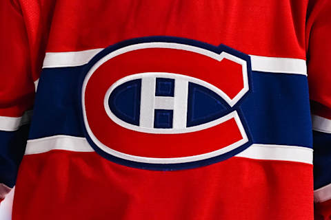
Montreal Canadiens
Untouchable
This set is probably the most iconic uniform set in hockey history. The timeless logo, the unique striping pattern on the home red, everything together the way it’s been since the inaugural year of the NHL in 1917. For something that’s seen as much success, with both Cups and Hall of Fame players, it’s a mortal sin to touch this brand.
Ottawa Senators
Bring back either their 1920’s look or 1990’s. Either way, lose Reebok style.
Ottawa’s original entry in the NHL was between 1917 and 1931, and they used red/white/black barber poles, something the Sens 2.0 have let slip back into their current look (very good). The second coming of the Sens was in 1992 and had a pretty conservative look until that red/white/black weird striped jersey came out.
After that, Reebok ruined the unique look and turned it into a template color-by-number uniform. We can all agree, either of their first two brands would work much better than what they have now.
Tampa Bay Lightning
Lose the black third jersey, have a more unique design for the home and road
The Lightning have very plain uniforms except for two parts. Firstly, the lightning bolt on the side of the pants, which should never leave. Secondly, the black third jersey, which is an abomination and should be thrown away. Now, going back to their home and road uniforms, they’re just plain Jane. While that’s fine, you can’t help but think that some new feature on those uniforms could be a welcome addition.
Toronto Maple Leafs
Not much
The Leafs have kept it relatively safe over their 90+ years of being the Maple Leafs (they were the Arenas and St. Pats until 1927). Blue, white, maple leaf logo on the front, that’s about it. Everything else are just minor details.
There were some changes to the design over the years, namely the uniforms worn between 1970-1992. After 1992, they’ve changed little, and staying simple is something the Leafs do well. There isn’t anything to change with the current look.
Central Division
Chicago Blackhawks
Not much
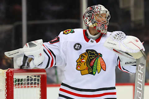
Aside from fidgeting with the collar over the last few years, the Blackhawks’ main identity has been the same since 1955. This is for good reason, as the brand is one of the finest in hockey. As the case with other Original Six teams, the Hawks don’t have any changes they need to make to their current set to improve it.
Even their third jersey, which is their Winter Classic jersey from a year ago, is great as an alternate, as well as reaching back into history to rehash a great look from the 1920s. No complaints here.
Colorado Avalanche
Not much
The Avalanche came to Denver and established a great look that paid tribute to the Rocky Mountains they call home. The color scheme was unique, burgundy and blue, and the uniforms worked well. The age of Reebok ruined those uniforms, but the Avs brought them back when Adidas took over, and we are all happier for that.
This is what Avalanche uniforms should look like. I do miss the Bigfoot logo, but that’s just me. The alternate pays tribute to the Colorado state flag, and as far as alternate jerseys go, this is a good one. If the Avalanche stay with these uniforms, it’d be just fine. Maroon is a rare color for jerseys, but it looks good.
Dallas Stars
Not much
I am a big fan of the Stars’ uniforms with the star pattern on the jersey, a design they kept from 1997 to 2007. It was unique, they owned their colors, and won using it. Along came Reebok and killed it with fire.
The Stars uniforms turned into boring college-style uniforms with almost no character anywhere. Their 2013 rebrand, which gave us their current look, was much needed and did wonders to the brand. The shade of green is unique and owned by the team, the logo is simple and good, and the design of the jersey is simple and conservative, which works really well.
I don’t see how you could improve it much. If they add an alternate, I would love it if they used the pattern from this unused North Stars jersey on a black base.
Minnesota Wild
Not much
The Wild debuted in 2000 with an excellent logo and great colors to work with. After a brief departure to a red-centric home jersey in 2007 when Reebok took over, the Wild returned to green full time at home with their Adidas jerseys, and it’s a welcome change. They also have some symmetry between their home and road uniforms now, something they didn’t always have. It’s a good look overall, and there isn’t too much to change.
Nashville Predators
Add navy shoulders to both uniform sets
Nashville has taken ownership of gold as their main color. While that’s all well and good, they need a little more contrast and consistency on their uniforms to make it work. A simple way to do this is, make the shoulder yoke navy instead of yellow on the road and non-existent on the home. I don’t mind the way it looks now, but with the yellow helmets, it’s almost too much. A touch of contrast will go far for this brand that’s come a long way.
St. Louis Blues
Change the uniform numbers on the home jersey back to yellow
The Blues have had yellow numbers on their home uniform for the first 50 seasons, and white numbers for the most recent two. The Blues have won more Cups wearing white numbers than yellow. Winning does help the brand become more iconic, but so does time. The Blues have always had that yellow on blue numbering pattern that’s lasted so long and looked so good, it still looks kinda funny. That’s my only critique for the Blues. Those thirds look amazing.
Winnipeg Jets
Not much
Since their triumphant return to Winnipeg in 2011, the Jets have worn the same uniforms, and they look perfectly fine. Throw in a simple yet gorgeous third jersey and a throwback that’s perfect as a throwback, the Jets are all set. There isn’t a whole lot the set needs in the way of improvement, so just keeping it as is and letting it become a classic is a good way of strengthening the brand they’re trying to build as the new Jets.
Metropolitan Division
Carolina Hurricanes
Use the original warning flag striping pattern on both home and road prominently
The original Hurricanes jerseys were great. They had a simple design, and used the hurricane warning flag as a striping pattern around the hem, which was a beautiful design detail. Those stripes stayed around until 2013, when they were banished to the hangar treatment for no apparent reason.
Now, the pattern is back on the hem of the home uniform but sublimated red on red. Bringing back the original hurricane warning flag stripes across the hem would really boost these uniforms, giving them that unique look that teams should shoot for.
Side note, I don’t care much for the black jersey, but it is what it is.
Columbus Blue Jackets
Have some fun with the sleeve stripes
The Blue Jackets have grown into their look nicely over the years, with their home and road jerseys pretty much the same since 2007. They look pretty good, not too much to complain about. My only quibble is that the sleeve stripe base color matches the rest of the jersey, which is fine, but it could look better somehow.
Maybe if they treated the home similar to how they did their originals, it would look better. I would have to see that for myself, of course, before making that official judgment call. I do like the star on the wrist, but it’s hard to see on TV, especially with the way hockey gloves fit. The third is perfect as far as thirds go, so I’ll leave that as it is.
New Jersey Devils
Bring back the hem stripes
Ever since their move to New Jersey, the Devils have had pretty much the same look, with some changes in 1992 (like going from green to black as a secondary color). Along came the age of Adidas, and the Devils took the opportunity to try a new look and lose the hem stripes. While the new uniform doesn’t look as bad as originally thought, the older ones were much better. Sometimes, the less is more approach isn’t the right way to go.
New York Islanders
Stop trying to make new designs. Like ever.
The Islanders’ brand has a lot in common with their days of success, for good reason. The look is clean, crisp, and aged very well. The only trouble the Isles have had is when they tried new things.
Going through the list of uniforms that didn’t stick, we have Fish-sticks on acid, orange, Reebok-ification, whatever the heck this black one was, Stadium Series mess, and brand unification with a team that shares the arena they’re moving out of. Let’s stop trying, and stick to what works.
New York Rangers
Untouchable
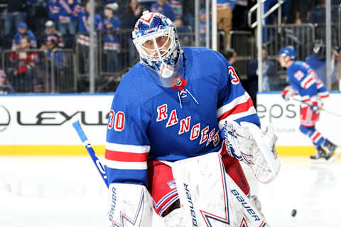
There are two times in history the Rangers didn’t use their current look that’s been around since 1926. In 1946, they tried a look that works for college teams, which as we’ve seen with the Dallas Stars, should be kept in school.
In 1976, they changed to something that resembles what the Winnipeg Jets would wear for their first few NHL years. These lasted a combined three seasons before returning to what worked. Their current look is classic, unique, and should never have changed, nor be changed ever again.
Philadelphia Flyers
Lose the black third jersey
The Flyers’ current home and road sets are perfect. It mirrors the iconic Broad Street Bullies uniforms, strong on orange, and has a unique feature (the contrasting name-bar on the back).
While their current black third jersey has that contrasting name-bar, it’s black on black on black, which just doesn’t flow well with the in-your-face orange the Flyers own. It also reeks of Stadium Series (which has never put forth a good uniform, ever. Debate me). Own the orange, get rid of the black-centric business.
Pittsburgh Penguins
Make that yellow third more consistent with the rest of the uniform set
The Penguins brought back their Lemieux era uniforms back full time in 2016, which was the right thing to do. While adding the yellow third jersey isn’t a bad idea, the execution was a little off. It does come close to matching the 1981 to 1983 yellow uniforms the Pens used, granted, but there are a few minor changes that could really be used to refine the third jersey to make it look that much better. If they touch it up to make it align with the rest of the uniform set, it’d look much better.
Washington Capitals
Overhaul using a modernized version of the throwback as a base
The Capitals have had the same look since the dawn of Reebok, and it’s perfectly OK. The modernized vintage logo looks solid, and the Weagle secondary logo is brilliant.
However, an issue stems from the uniforms. It smells of Reebok panels. Navy side panels, the sleeve treatment, not a great look. However, those third jersey throwbacks are beautiful. Why not make a modernized version, including the stars everywhere, to make a new great uniform based on the classic. Why shouldn’t it work?
Pacific Division
Anaheim Ducks
Bring back Mighty brand
I know it’s not a popular opinion, but I think this was the best, most consistent look the Ducks have had. The duck mask logo is widely celebrated by hockey fans, and the eggplant and jade color scheme was unique to the team.
Currently, the team uses a rather bland webbed-D for their logo, as well as a black-centric color scheme with lots of complicated stripes in their full time uniforms. Bringing back the Mighty uniforms would be a welcome change.
Arizona Coyotes
Add Kachina patterns to the home/road jersey
Bringing back the black Kachina jerseys was a much bigger winner than the Coyotes ever expected, to the point where they elevated the jersey from a one-off special jersey to full blown alternates.
The question remains, why don’t they incorporate any of this design to their current uniform set? Here’s what we propose: Strip down the home/road to the bare brick/white, add the same sleeve and hem pattern as the original Kachina jersey, win. No need to change the logos either. Why shouldn’t this work?
Calgary Flames
Use original uniforms full time
The Flames currently hold the crown for ugliest jersey in the NHL with their red home jerseys, complete with black numbers and armpit stripes. They have a stunningly gorgeous alternate jersey, void of black and using far more traditional striping.
This jersey matches their original jerseys from 1980 to 1994 almost perfectly, and it was a look that aged very well and had a Stanley Cup title to boot. The Flames should turn to these uniforms for a full-time home jersey, and make a matching jersey as a road white. Supposedly this may already be in the works, in which case the hockey world will be made a better place soon.
Edmonton Oilers
Use original uniforms full time
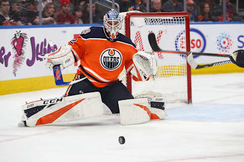
While I appreciate the fact that the Oilers wanted to try something and use those orange jerseys that sold so well as alternates, the better uniform has to be the Gretzky era royal blues. After a switch to navy in 1996 and a bout with Reebok uniforms lasting until 2011, the Oilers switched back to their classic blue and orange look.
The logo is the same, the colors and striping were the same, it worked. Why they felt the need to go full-time orange, I don’t quite get. Points for originality with their new alternate leaked here, but I think they are one of those teams that got it right the first time.
Los Angeles Kings
Bring back purple and yellow full time
The Kings currently wear the same black and silver combination they did in the Gretzky era between 1988-1998. Before that, though, was the unique combination of purple (forum blue, technically) and gold, much like their arena roommates, the NBA’s Lakers. They have thrown back to this design a couple of times in the past few years, and it looks much better than the black and silver they have now. It’s a more unique color set, and would be amazing.
San Jose Sharks
Substitute silver for orange almost everywhere
The Sharks own their color. It’s perfect. The uniforms really do a great job to show that, even the black one. The only real idea I could find, and it’s a minor change, is to change the orange trim to silver to match with the original teal uniforms that looked so good. Keeping the eye in the logo orange is fine, but the stripes on the home and road could be changed to silver, and it’d look just as great, if not better, than what it does now. But again, it’s splitting hairs.
Seattle Totems/Sockeyes/Kraken/Metropolitans/etc.
Use those salmon/aqua colors creatively, have some fun with local themes
Yup, Seattle’s franchise made it here. Much of their brand, including name, logo, and uniforms, are still under wraps, and coming potentially any month now, so nothing much to analyze. However, their website has colors, and they are unique to the NHL to say the least.
And that’s great! Now roll with it. Use those colors well and creatively. Incorporating a local theme, kinda like what the Seahawks do, is highly encouraged. I, for one, am counting down the days until we see what Seattle has in store for us.
Vancouver Canucks
Add negative space V’s on the sleeve stripes
The Canucks have been known to have a fascination of the letter V. It didn’t start with the infamous Flying V uniforms of the 1980s, in fact, rather right from the beginning with a clever little design that spoke volumes.
Look at the sleeves on their original home and road uniforms, and you’ll find a V in there. It’s simple, but it’s a genius move, especially on the white uniforms. Adding this would be a simple change, yet would elevate their current uniforms from decent to great in an instant.
Next. Every Team's Mount Rushmore. dark
Vegas Golden Knights
Not much, yet
It’s been two seasons for the Golden Knights, and so far so good on the ice. For the first time in NHL history, metallic gold flakes have made their way onto a uniform, and you know what? It looks pretty good.
On top of that, they have a sublimated flourish pattern on the stripes and logo which are a very nice touch. Now, slate gray and black together is meh, but it makes sense, and the bright shiny gold works well to contrast it. This brand has the potential to age well, so let’s give it some time before coming up with ideas on how to fix it.